Visualizing Change Over Time

The EO Dashboard allows users to independently explore indicators, but it relies on visual interpretations to understand what is changing and where. How could the Dashboard do a better job of highlighting significant change, and point the user in the right direction?

KHOP: Immunize against the barriers

Summary

The project KHOP generalizes the world's most haphazard concept on corona-virus disease vaccination data-map modeling. The system provides detailed information that prohibits vaccines for different databases. The work intends to analyze the data collected from legion sources, predict the destined situation for pandemic waves varying from locations, and evolve awareness towards precautionary preventive measures: the process and activation of the threat observant system to alert the user's heat map model. A well platform is created where people can book their slot for vaccination via the web registration form for hassle-free and safe conductance of its campaigns to scrutinize scenarios.

How I Addressed This Challenge

Development


We developed an interactive and user-friendly web application that displays the COVID-19 situations. The research up to cases in the particular area, vaccinations available, and dispatched. It analyses, visualizes, and predicts the future Corona-virus vaccination data and solves the inferior condition that may occur by the possible pandemic.


Importance


  • By collecting the data, if we cannot utilize it, it won't be very sensible. So, by visualizing and analyzing it, we can predict the future and minimize the risk of losing people's lives.
  • It provides an easy platform for each person to understand data and its flow by protecting themselves from their entire communities. 
  • The project aims to optimize the vaccine supply chain.


What does it do?

  • Rapid vaccination
  • Essentials supply of vaccine from information analysis 
  • Decrease the Covid-19 mortality rate


How does it work?


This project helps to decrease coronavirus cases and mortality rates by which helps to stabilize people’s sustainable lives and maintain the economic pattern to survive.


What do we hope to achieve?


We took this challenge Interconnected Earth System Impact intending to mitigate the COVID 19 situation. First, we collected the required data regarding covid 19 vaccines and cases in the World to utilize this idea among other developing and underdeveloped countries like Nepal. We tried to see and show how the Covid situation and its mitigation approaches are being carried out in the World. The situation of an underdeveloped country lacks the facility of vaccination and proper dispatch management. The overall process is not interpreted as the severe case prior rather than the serious case. Nationwide studies are needed to measure public awareness and perception regarding the new vaccine to work out the factors related to vaccine hesitancy, report adverse events following immunization, and generate evidence on vaccine-induced immunity in the communities. In the race for a secure and effective vaccine against Coronavirus, disease-19 manufacturers play a critical role throughout the event, clinical test, manufacturing, supply, and vaccination phases. For the efficacy of Coronavirus disease-19 vaccine, proper transport, storage, vaccine carrier, adjuvant, dosage form, and route of vaccine administration plays an important role in immune reaction. Within the context of no more people willing to buy a Coronavirus disease-19 vaccine, the logistics of producing, storing, and distributing the vaccine and mass vaccination are essential. It's urgent to enhance health promotion and reduce the barriers to Coronavirus disease-19 vaccination.


  • The various data collections from NASA, ESA, and JAXA on the Earth Observing Dashboard are confined to reliable data sources and information.
  • We have to solve social effects throughout this hackathon categorized with the indicator displayed on the Dashboard. 
  • Hackathon is determined/managed on a particular time period, and this project work is to be under a definite time-bound.
  • The vital role is data modeling measures and project interpretation which should conceptualize the project contribution as a national and international platform.
How I Developed This Project

Inspiration


It has already been one and a half years since the world faced the uncontrolled wrath of the COVID19 Pandemic. The Pandemic brought us to nearly think deeply on world diplomacy and combat together not as a nation but also as earthlings. If it were not for vaccines, all our joint resolutions would still seem helpless against COVID19. Accordingly, vaccination has now become the utmost priority of every country. But, the track and easiness of vaccination campaigns still seem problematic in most under-developed and developing countries like ours. If we see our country's progress, it has already been 155 days since the vaccination campaign started. Still, only 2.5% of the total population is fully vaccinated, and if the drive runs at this pace, it will take 12 years to vaccinate the whole population of our country fully. At this speed, none of the country at level best of ours could ever be able to avoid the future covid wave threats, so; this was the very dawn of idea behind the automated web tool, KHOP, that keeps track of all vaccination-related data and helps in effective dispatching of vaccines classifying according to its emergency need. 


Approaches


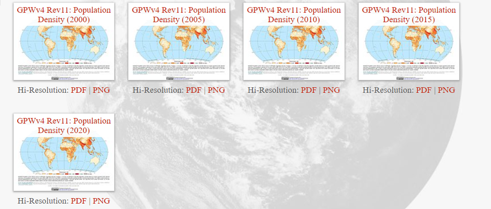
Firstly, we commenced fetching the Earth Observing dashboard .csv file data to inspect the country-wise vaccination progress. As a specimen for our web app prototype, we only used the data of Nepal. Next, we fetched the provincial COVID case and vaccination data from MoHP (Ministry of Health and population) to organize further the data in our web application for easy public access. 

Acknowledging the slack and severity of vaccine supply state, we mounted the system to order the need of vaccines by preferential order visualizing the variation/change in COVID cases, Mobility rate, and lockdown strictness factors. In addition, we further devised an algorithm where the public can find if the vaccines are in stock in their proximal locations and book their slot for vaccination via the web registration form for hassle-free and safe conductance of vaccination campaigns.


Tools used


The language used: JavaScript, Python

Library used: React, Pandas, Numpy, Matplotlib, Plotly, Scikit Learn

Additional: Jupyter Notebook, VScode


Problems:


To get a hold of the regional vaccination data of our government, we had to go through a hectic, long, and uncertain process. We drafted a proposal and cover letter to present to the ministry, but they clearly refused to help with the data before the Hackathon submission deadline. And While processing a large data set, the developer's device crashed, which was our project's main issue.

Furthermore, the topic itself derived a unique way to demonstrate the vaccination system; that’s why we faced some unusual data visualization bugs finding the proper data-set we needed from the Earth Observing Dashboard.


Achievements


We overcame a hard time building the prototype of our web application and data extraction. Although the development pace was slow, we successfully encapsulated our basic idea into the web application. With all remaining data sets, generated the heat-map and interpreted the further details of the information.


How I Used Space Agency Data in This Project

We've used the population density data of NASA SEDAC, ESA Applications and have handled several Services and APIs. In addition, we used the ESA's heatmap of the Kathmandu district, population density, to plot the need for vaccines corresponding to the population density.


https://www.esa.int/ESA_Multimedia/Images/2016/10/Kathmandu_Nepal#.YNpD5xfCP1I.link


Earth Observing Dashboard Integration

Data collection of different large sets of data from NASA, JAXA, and ESA on the Earth Observing Dashboard. We use machine learning and computational programming to represent the graph of that collected data source. Here, first, we have a CSV file of countries data set, then users hover or click on different countries after that countries name is passed in URL, by which we fetch country data, and create all the required UI of our project. Various data sets proceed for data extraction, data cleaning, features engineering, data analysis/interpretation, and data visualization since machine learning is implemented on UI.


The implementation of code and EO Dashboard data to represent it on time series graph and choropleth.


Tags

#socialimpact #Vaccination #Covidcases #Covid19 #Interconnectedness #Nepal #Global #EOdashboardhackathon #EOdashboard

Judging

This project has been submitted for consideration during the Judging process.