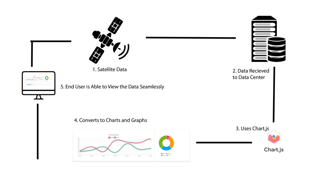
Visualizing Change Over Time

The EO Dashboard allows users to independently explore indicators, but it relies on visual interpretations to understand what is changing and where. How could the Dashboard do a better job of highlighting significant change, and point the user in the right direction?

Everyday Visualizer

Summary

Everyday Visualizer helps to bring Complex Data from Satelites and various other data sources. This will help Scientists and Researches and other people working in various fields be able to access and understand the data with ease. It also includes a Design Element that will improve the user experience

How I Addressed This Challenge

My Project addresses the challenge by making complex Data from Satelites and various other data sources simple. Scientists, researchers and people from various other fields can access and understand this data with ease. By adding a design element it helps people to visualize this data over time. The Data can be converted to graphs and charts using charts.js and can be presented on the platform

How I Developed This Project

I have used Adobe Illustrator for this Project, I have analyzed the Design of the EO Dashboard and added a Design Element which may improve the experience

How I Used Space Agency Data in This Project

https://eodashboard.org/

Project Demo

A Slider can be added to the Design of the User Interface so it will be easy for the user to visualize change over time.

Data & Resources

https://eodashboard.org/

Judging

This project has been submitted for consideration during the Judging process.