Awards & Nominations
Prometheus has received the following awards and nominations. Way to go!


Prometheus has received the following awards and nominations. Way to go!
The EO Dashboard allows users to independently explore indicators, but it relies on visual interpretations to understand what is changing and where. How could the Dashboard do a better job of highlighting significant change, and point the user in the right direction?
Welcome to a new way of seeing and interpreting data!We, from the Prometheus Group, aimed at improving the EO Dashboard in terms of visualization and interaction, making all the information even easier to grasp. All making use of GIFs, pop-up windows and different color modes, not only to enhance the experience but as long as to make it accessible for an even larger group, colorblind people.Our goal is to bring the visual information right before your eyes, no matter how special they are.
The page layout was rebuilt so we could show users the data in a better way. By changing the way that the text and the map appear in the page, we were able to reduce the amount of information shown at once, this created a cleaner site which can help to a better understanding of the statistics. We also changed the information part (the right-side window that shows graphs, pictures and text) and made it so that it only appears as a pop-up window, reducing the amount of data shown from the beginning.
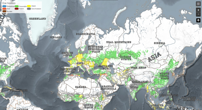
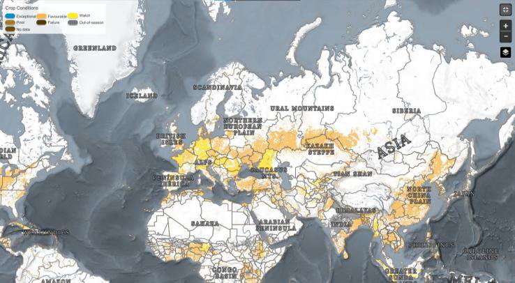
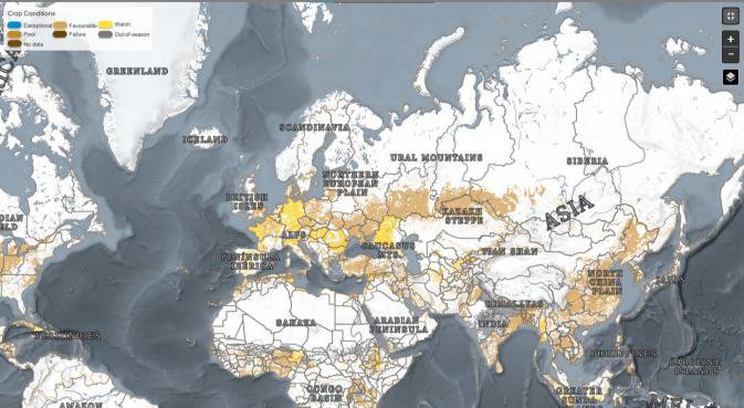
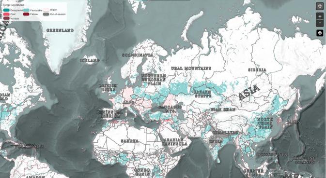
In addition, the color blindness adaptation is important because it shows a level of concern with accessibility, the original page was a little bit confusing for colorblind people, as the page used many colors to show different information, so we thought about a new way of showing this data. Therefore, maps could use White to Black scales rather than multi-colored ones or use hatched areas beside color scales or even contour lines.
Also, by changing the way comparisons are made on the page, we aimed to bring a smoother and easier experience to the user. By displaying a GIF, other than a bar separating the different data on the map, we could enhance the visualisation of Change Over Time. This helps the user to understand in a more intuitive way how the tool works and provides a cleaner workspace, allowing the users to downplay the screens they are not interested in.
Furthermore, if changing the way that data is displayed is hard, we thought of another form to provide accessibility, which is the option to allow conversions for the three types of color blindness, a group of people is put at a disadvantaging point with maps that use a lot of colors. Through this, by clicking a new icon with the shape of an eye on the left-bottom of the page, three new buttons are displayed: “p”, “d” and “t”, which stand for “protanomaly”, “deuteranomaly” and “tritanomaly”. Thus providing, after the click, a different color scheme to the page that best suits each type of disability, improving the experience of this group.
With this project, we hope to reach a larger group of people in addition of creating a more user-friendly interface. Moreover, our suggested changes would make it easier to understand how the data changes throughout a specified timeline.
After reading the proposal and all of the challenges, we had a few good ideas and decided that the Change Over Time better suited our team.
When we read the challenge our first step was opening the EO Dashboard and trying to understand the data so we could spot everything that was not exposed so clearly. After that, we brainstormed to discuss what could we change to provide a better experience for the user. Then we decided to develop a Mockup, using Canva and PowerPoint to design screens and animations to bring our ideas to life.
We had some trouble finding faster ways to solve the accessibility for colorblind people, since the extensions we found were Google Chrome exclusives or simply didn’t exist anymore, but in the end we came up with other ways of providing this.
Since our project is a new way of viewing the available data, we used all that was provided for us, besides that, we suggest a feature that generates a GIF with a time interval that would be selected by the user. For example, if 01/01/2021 and 01/06/2021 were selected, the EOD will display an image literally changing over time with the data available.
The project we planned to develop is a rebuilding of the layout that is currently in use and a tool to provide accessibility to colorblind people, these kinds of modifications can be integrated by modifying some characteristics of the CSS and small structures of the HTML. Furthermore, we added to the project an option to generate an animation that will provide a better understanding of the changes over time that can be applied with some script language that will generate a GIF from images received by the database. It is worth reasserting that these ideas are directly related to the Earth Observing Dashboard in a way that it can be easily integrated with application.
In order to make our project a reality, an integration with the Earth Observation Dashboard Database would be necessary. Also, the maps with the correct colors and the GIFs that will show the changes over the time can only be generated using the data from the Three Spacial Agencies. Furthermore, we collected some information about color blindness to complete our thoughts, these information can be accessed through the links bellow:
#layout, #mockup, #color_blindness, #integration, #GIF, #date_interval, #Prometheus
This project has been submitted for consideration during the Judging process.