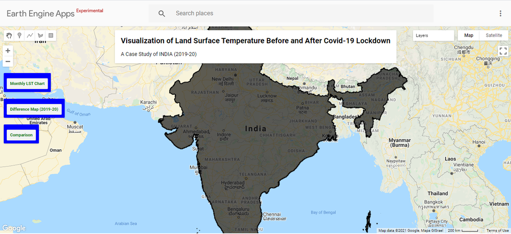
Heat Release Application
An application is developed to visualize the Land Surface Temperature (LST) using Google Earth Engine and to compare the temperature impact before, during/ after Covid-19 Lockdown. In the application three button are kept.
1) When the user clicks on the Monthly LST Chart Button, The LST chart of the years 2019 and 2020 is represented in the panel.
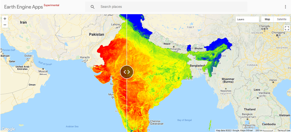
2) When the user clicks on the Difference Map (2019-20) Button, the difference map showing the mean annual change in temperature is visualized on the screen.
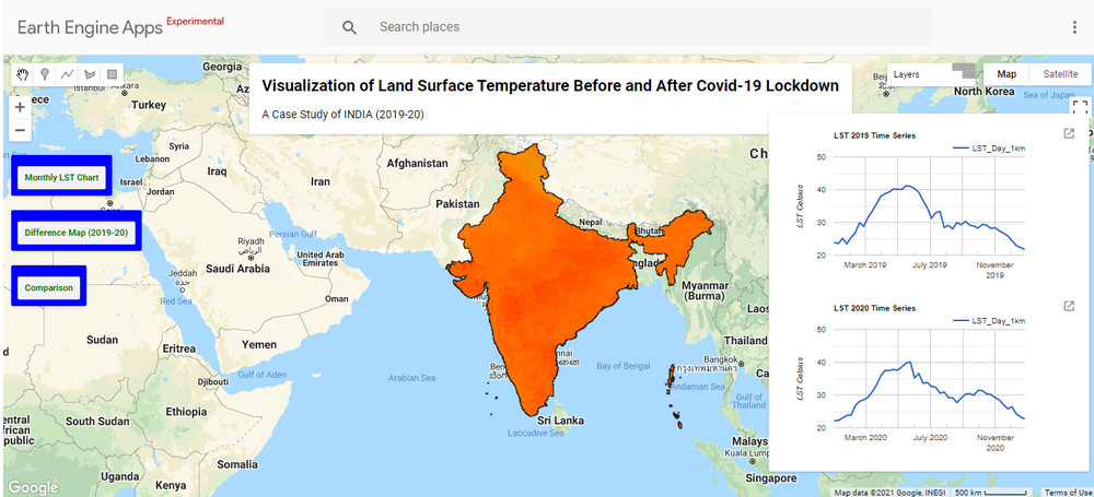
3)When the user clicks on Comparison Button, the split panel function is called to visualize the LST map. The left side panel map represents the before lockdown map (2019) and the right side panel represents the after lockdown (2020) LST map.
From the Eodashboard, Air pollution and Greenhouse gases statistical values were taken into account for correlation with LST.
Web Application Interface of Heat Release App.
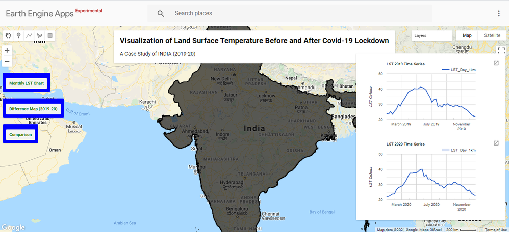
Chart showing the Monthly LST in Celcius of the Year 2019 and 2020
Map showing the difference in temperature between the Year 2019 and 2020
Split Panel visualizing the LST in Celcius of the year 2019(Left Panel) and 2020 (Right Panel)
Land Surface Temperature Importance and role in the environment:
Land Surface Temperature is an important variable within the Earth climate system. It describes processes such as the exchange of energy and water between the land surface and atmosphere. Land surface temperature is how hot the surface of the Earth would feel to the touch in a particular location. From a satellite’s point of view, the surface is whatever it sees when it looks through the atmosphere to the ground through thermal sensors. It could be snow and ice, the grass on a lawn, the roof of a building, road, factories, or the leaves in the canopy of a forest.
Land surface temperature is monitored because the warmth rising off Earth’s landscapes influences our world’s weather and climate patterns. Due to Covid-19 Lockdown, human activity came to a standstill and it has a positive impact on the environment and it resulted in a reduction of overall Land Surface Temperature which had lead to reduce global warming and a decrease in the overall temperature of the earth surface. Accurately understanding Land Surface Temperature at the global and regional level helps to evaluate land surface-atmosphere exchange processes and, when combined with other physical properties such as vegetation and soil moisture, provides a valuable metric of surface state.
LST is monitored to know the relationship of increasing atmospheric greenhouse gases and how rising land surface temperatures affect glaciers, ice sheets, permafrost, and the vegetation in Earth’s ecosystems. Commercial farmers may also use land surface temperature maps to evaluate water requirements for their crops during the summer when they are prone to heat stress. Conversely, in winter, these maps can help citrus farmers to determine where and when vegetation could have been exposed to damaging frost.
Many Urban areas are facing the Urban heat island which is a slow disaster that directly and/or indirectly affects everyone living on earth. LST is used to monitor the urban heat islands. UHI occurs in an urban area or metropolitan area that is significantly warmer than its surrounding rural areas due to human activities. The temperature difference is usually larger at night than during the day and is most apparent when winds are weak. UHI is most noticeable during the summer and winter. The main cause of the urban heat island effect is the modification of land surfaces. Waste heat generated by energy usage is a secondary contributor. As a population center grows, it tends to expand its area and increase its average temperature, but due to lockdown almost there was no activity in urban areas which has lead to a reduction in urban heat islands and has decreased the average temperature of urban areas.
By using the MODIS Satellite Images the Land Surface Temperature is evaluated using Google Earth Engine and by using the split panel a comparison is made to get the difference in temperature (in Celcius) before and after lockdown. It will help to evaluate and monitor the environmental impact due to Lockdown.
Hope to achieve from this project:
We hope to fill up the gap and establish relationships between the different environmental parameters such as air quality, greenhouse gasses, weather, etc. with LST.
And our main aim is to visualize Land Surface Temperature significant changes that occurred in the area due to covid-19 Lockdown.
Case Study: Comparison of Land Surface Temperature Of INDIA (2019 and 2020)
India is in Southern Asia. India lies to the north of the equator between 8 degrees 4 minutes and 37 degrees 6 minutes north latitude and 68 degrees 7 minutes and 97 degrees 25 minutes east longitude. It is the seventh-largest country in the world, with a total land area of 3,287,590 km². In India out of the total population of 1210.2 million as of 1st March 2011, about 377.1 million are in urban areas. The net addition of population in urban areas over the last decade is 91.0 million. The percentage of the urban population to the total population of the country stands at 31.6. There has been an increase of 3.35 percentage points in the proportion of the urban population in the country during 2001-2011. Further, the number of million-plus cities/urban agglomeration UA has increased from 35 in Census 2001 to 53 in Census 2011 in India.
The geography of India is extremely diverse, with landscapes ranging from snow-capped mountain ranges to deserts, plains, hills, and plateaus. India comprises most of the Indian subcontinent situated on the Indian Plate, the northerly portion of the Indo-Australian Plate. Having a coastline of over 7,000 km most of India lies on a peninsula in southern Asia that protrudes into the Indian Ocean. India is bounded in the southwest by the Arabian Sea and in the southeast by the Bay of Bengal. The fertile Indo-Gangetic plain occupies most of northern, central, and eastern India, while the Deccan Plateau occupies most of southern India. To the west of the country is the Thar Desert, which consists of a mix of rocky and sandy deserts. India's east and northeastern border consists of the high Himalayan range.
India's climate is strongly influenced by the Himalayas and the Thar Desert. It is difficult to generalize India's climate. India's huge size sees climatic conditions in Kashmir having little relation to that in the extreme south. In addition to this, the varied topography of the land sees many regions having their own microclimates. The climate in India ranges from tropical in the south to a temperate climate in the north. Parts of India in the Himalayas have a polar climate. Summer lasts between March and June in most parts of India. Temperatures exceed 40 °C during the day. The coastal regions exceed 30 °C coupled with high levels of humidity. In the Thar desert area temperatures can exceed 45 °C.
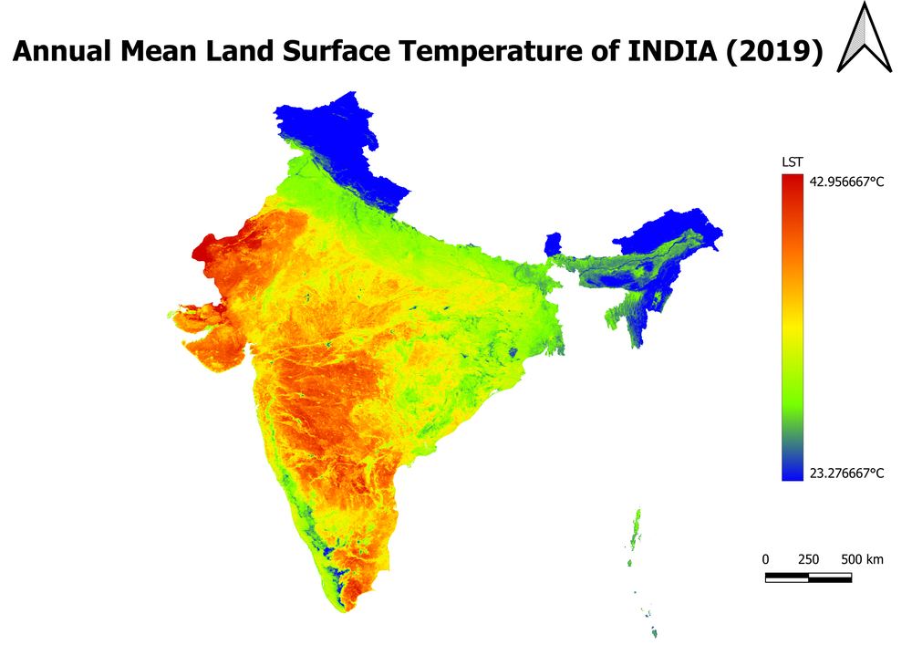
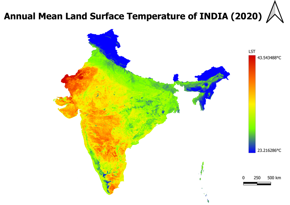
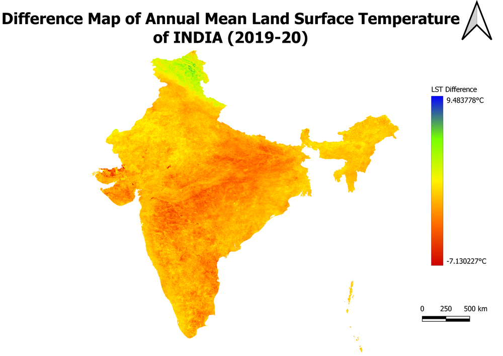
By visualization of mean LST of 2019 and 2020, it is clearly visible that the land surface temperature has significantly decreased in many parts of India due to lockdown. The difference map shows the -7 Degree to + 9 Degree change in the area.
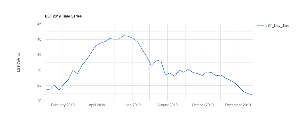
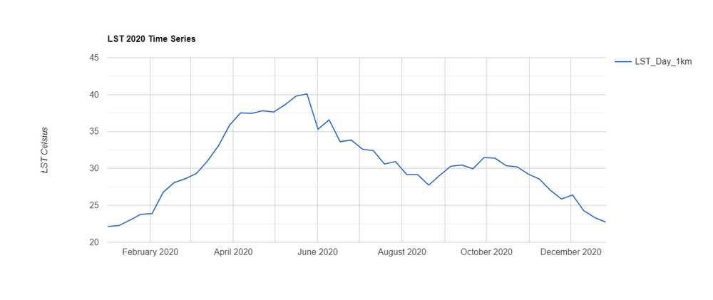
The chart shown above shows the monthly LST of the India Region which is developed using Google Earth Engine. The month of April and May in 2020 shows the decrease in LST due to Lockdown whereas 2019 the LST was maximum in April and May month.
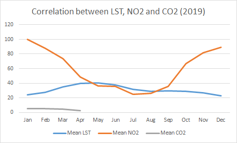
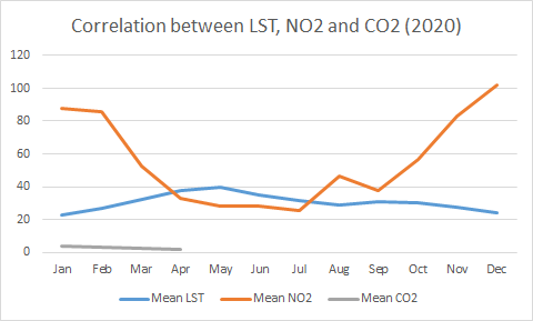
The above graph shows the correlation between LST, NO2, and CO2. It states that as the air pollution is decreased in the atmosphere the land surface temperature is described as no heat is trapped in the air. Due to Lockdown, the Ozone layer depletion has also reduced as a few amounts of greenhouse gases were emitted into the air.
Thus, Land Surface Temperature has significant positive change due to COVID-19 lockdown on our environment.