Multi-Mission Earth Observation Data Visualization

The EO Dashboard is derived from a suite of different satellites from the EO observation (EO) programs of the three collaborating space agencies: NASA, ESA, and JAXA. Your challenge is to devise a way to visually fuse information from diverse Earth observation datasets of different missions.

EO-Assistant bot

Summary

Our project consists on making easier to find and understand data provided by NASA, ESA and JAXA. We are a group of students who know how easy it is to feel discouraged by not understanding immediately a topic or a graph/drawing, and even more if after watching a tutorial there are no improvements. After this and other factors, we have agreed to design and program a bot which's main aim is to facilitate and enhance the information at some platforms (in this case, for the EO DASHBOARD worldwide map and categories). In addition, it can be attached as a tool to the dashboard for users to use it as a guidance of interpretation.

How I Addressed This Challenge

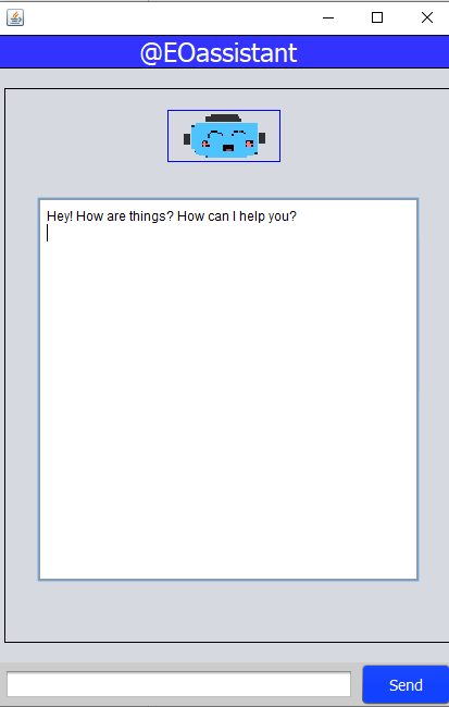
Due to our objective being how could we fuse/merge different EO products or indicators into single meaningful views that could provide more insights than the individual products viewed separately, and additionally the fact that there are already some other platforms which show this same information in maps/graphics/searchers, we tried to design a more interactive tool for those who may need any guidance at the moment of interpreting the data. How are we willing to achieve this? By creating a user-friendly platform, where the user may chat with a bot which will provide any kind of information that can be found at the maps provided at the DASHBOARD. Our EO-Assistant bot has been programmed to process and understand the information/question entered by the user and provide a suitable answer as regards the topic. Furthermore, it is even configured to comprehend grammatical and spelling mistakes: for example "Population", "population", "poplation", "Poplation", "greenhouse", "gases", "Greenhouse", "Gases", "gaces", "Gaces", "Greenhouse Gases", "cropped", "area", "Cropped", "Area", "croped", "Croped", "Cropped Area"... Thereupon, we have included some bot answers as regards world population, cropped areas and greenhouse gases(as a preview). Moreover, our bot has a calid image and easy-understanding language destined for those who are not acquainted enough with complex terms.

How I Developed This Project

We have been inspired to create this tool as some people may find difficult to read and comprehend colors or even the meaning of them in relation with scales and indicators, or even infer why the results are like that. The application was developed in Java using the Apache NetBeans 12.0 IDE. Throughout its development some problems arose as I am not used to GUI programming, and it is possible that there is some kind of bug in the APP, but it is fully functional.

How I Used Space Agency Data in This Project

We based our research and information shown by only using the dashboard map and satellite images as inspiration and explanations provided by the bot. We consider that environmental problems and recent impacts as a result of Covid-19 are essential for people to know, not only because of general knowledge, but also due to the importance of raising awareness on those who may not we professionals or work at something related to the environment. A clear example of this might be the case of some students or initial learners who are willing to incorporate these topics and basic concepts and have no clue on where to start.

Earth Observing Dashboard Integration
Tags

#userfriendly #happyhacking #dashboard #assistant #indicators

Judging

This project has been submitted for consideration during the Judging process.