Urban Societal Behavior Patterns During COVID-19

The COVID-19 pandemic is currently bringing unprecedented impacts to every aspect of human life. Your challenge is to better understand societal trends in response to COVID-19 through the analysis of remote sensing data and products.
BAHC-19

Summary

The BAHC-19 (Behavioral Activity History of Covid-19) is a documentation of the behavioral activities during the covid-19 pandemic, aiming to provide information of the past to warn the people of the future if this incident were to happen again.

How I Addressed This Challenge

We developed a data comparison graph of economic data based on cars/container density data in the Earth Observing Dashboard and carbon dioxide level comparison to map out the emission levels. The importance of this project is to provide documented information when a pandemic strikes again so that the people of the future can act faster than we did.

We hope on achieving a historic analysis on economic standpoint so the future analysts can view articles and data easily when a pandemic occurs again.

How I Developed This Project

What inspired our team to choose economic impact is our keen interest in the economy as we are teachers of social sciences. Our simple approach was to look for countries that have similar indicators in both of their capital cities, then compare and contrast both their data on how they handled the covid-19 pandemic.

The tools we used in our research data are Earth Observing Dashboard activity csv data, and Excel. There were small errors in the programming in the R file and also in the planning phase on which specified data we are going to tackle, we were unable to solve the errors in the VIIRS data in LAADS DAC.

Using R studio we called the multiple CSV datasets with readxl in R and used ggplot to chart the data's.

How I Used Space Agency Data in This Project

The Earth Observing Data of Activity (cars/containers) was used as an output for a line graph on which multiple city's activity data for comparison using Excel sheet. The data analyst called all the CSV files to be read by the Excel graph displaying levels of activity by dates in a single output line graph for a comparative display.

Using R; the files on how we made the entire display of charts in the website is in this LINK.

Project Demo

Here is the link to a website documentation we made in R studio: https://bahc-19tabs.herokuapp.com/tab1

Here is the link to the slides: Github or Gdrive

Here is the link to the R repository in: github

Earth Observing Dashboard Integration

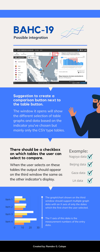
We are unsure if our solution can be integrated into the EO Dashboard as we only used Excel for the comparative data. Make sure you have installed the following softwares and data's:


BELOW IS THE INFOGRAPHIC ON HOW THE SOLUTION CAN BE INTEGRATED INTO THE EO DASBOARD:

Data & Resources

Singapore Data:


Nagoya Data:


China Data:


Programming:


Tags

#economic impact #BMHD #urban #mobility #Nighttime Lights #CO2

Judging

This project has been submitted for consideration during the Judging process.