Spatial Analysis and Time Series

The EO Dashboard has multiple global maps for air quality and greenhouse gases in GeoTIFF file format. Your challenge is to create a spatial analysis and time series plotting tool for EO Dashboard air quality and greenhouse gas GeoTIFF datasets.

The Air We Breathe

Summary

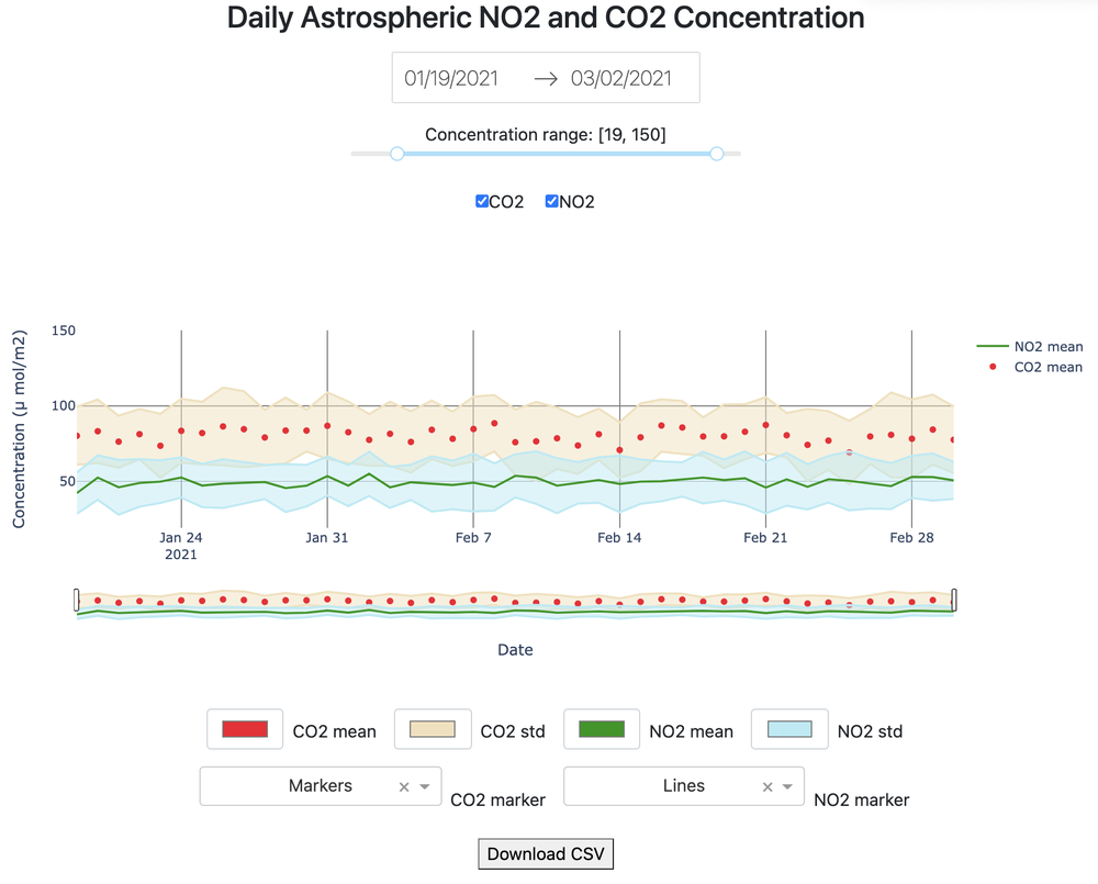
The project provides an analytical solution for visualizing NO2 and CO2 concentrations. The Dashboard provides functionalities such as:

How I Addressed This Challenge


I developed an interactive analytical dashboard which was written in Python by leveraging Dash and Plotly.

The dashboard is user-friendly and since Dash is a Python framework built on top of React, a JavaScript library, it is easy to integrate into the existing EO dashboard.

My project targets on answering all of the challenge questions, by implementing the following functionalities:

_ Selecting date range

_ Setting y-axis limit

_ Selecting type of gas

_ On/Off toggle for selective features

_ Different options for color and line modes

Additionally, Plotly provides extra tools such as a zoom-in window and download png.

How I Developed This Project

Since I am a data scientist, wrangling with data is part of my daily work. Visualization is the most enjoyable activity to understand data. I have been a fan of Plotly and that's why this challenge caught my attention.


There are 5 stages: understanding the requirements, looking for tools to solve the problems, designing the UI/UX, working on the backend, and integrating the front and the back.


I used Python to write the back-end with libraries such as Pandas and NumPy.

For the front-end, I used Dash and Plotly with libraries such as Dash Bootstrap and Dash Core Components.


Since front-end has never been my strong suit, I watched a lot of youtube videos to understand the layout design. I also have problems connecting to the database. However, I think the most important thing is to complete the project, and show what could be implemented later. Therefore, I created a synthetic dataset that would look similar to the real one and answer all of the remaining challenge questions.
How I Used Space Agency Data in This Project

I have used the data from Data hub and NOAA for research purposes. But since the main challenge of the problem is creating the analytical solution, I focus my attention on the dashboard and using synthetic data to speed up the progess.

Project Demo
Earth Observing Dashboard Integration
Data & Resources
Tags

#air_quality #dashboard #analytics #datascience #python

Judging

This project has been submitted for consideration during the Judging process.