Background
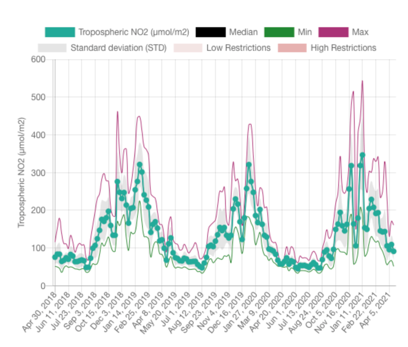
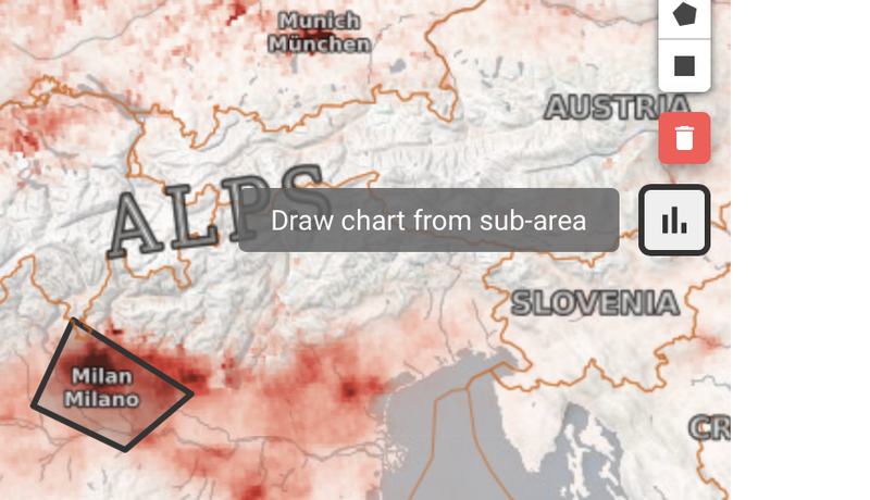
The Earth Observing (EO) Dashboard has multiple global maps for air quality and greenhouse gases in GeoTIFF file format. The TROPOspheric Monitoring Instrument (TROPOMI) is the satellite instrument on board the Copernicus Sentinel-5 Precursor satellite. The EO Dashboard has a tool that allows users to draw a polygon or rectangle around a particular area or region of interest on the ESA TROPOMI NO2 map, and the tool will calculate statistical information (e.g., median, min, max, standard deviation) and plot a time series for all the tropospheric NO2 data inside the user-drawn shape. Can you design a more user-friendly and configurable tool?
Objectives
Your challenge is to create a spatial analysis and time series plotting tool for EO Dashboard air quality and greenhouse gas GeoTIFF datasets. This plotting tool should maintain all the existing capabilities of the current tool (e.g., median, min, max, standard deviation for user drawn area of interest) and add additional user-friendly features, which may include (but are not limited to):
- The ability to modify the plot axis minimum and maximum values (for both the X [time] axis and Y [CO2 or NO2] axis).
- The ability to hide/show plot specific plot variables.
- The ability to download the calculated statistics as a comma separated value (.csv) file.
- The ability to change the color and symbol for the variables.
- The ability to plot two datasets on the same time series plot (e.g., both MEAN CO2 and DIFFERENCE CO2 for the same area of interest) OR plot CO2 and NO2 on the same time series plot.
Potential Considerations
- Note that the various datasets may have different time increments. For example, the ESA TROPOMI NO2 GeoTIFF data is for two weeks of data, whereas the NASA OMI NO2 GeoTIFF is for one month of data.
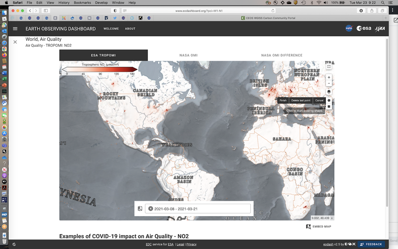
- The spatial and time series analysis tool can be found on the ESA TROPOMI map:
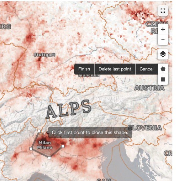
- Here are two closer views of the drawing tool to select the area of interest:
- And here is the resulting time series plot that provides results for the area of interest: