Awards & Nominations
Air is Life has received the following awards and nominations. Way to go!

Air is Life has received the following awards and nominations. Way to go!
The EO Dashboard has multiple global maps for air quality and greenhouse gases in GeoTIFF file format. Your challenge is to create a spatial analysis and time series plotting tool for EO Dashboard air quality and greenhouse gas GeoTIFF datasets.
NASA, ESA, and JAXA have analysis system called Earth Observation Dashboard. The challenge of this Hackathon is to solve t problem of spatial analysis and time series. It shows the air quality impacting by COVID-19. It is also studying the level of NO2 and CO2 in each spot in our earth. The data that available on the website is big and needs analysis with specific tools. The solution we come up with is an application used two areas such as Los Angeles USA and Paris France as a small example to test the application, however; it is not limited only to two areas. It can be used in many areas as the user and developer want. The application tools that build for this challenge is to help better u
The challenge is finding a method and tools to plot data for understanding and friendly users. We developed an application that can be collecting data “Excel” and connect that into MATLAB to analyze and plot graphs and tables for level NO2, Min, Max, Median, and standard deviation lines. The application we did in helping people who are looking for information and comparing two areas or more at the same plot. The application has two main points which are the Excel file and MATLAB file “app designer”. Excel can get the data from the developer or can be from the satellite system. After that MATLAB app designer get the data and plot graphs as the user want and download table data and save the plot as image. The user can hide/show plot-specific plot variables.
The main thing about selecting this challenge is the team's passion for dealing with data analysis and coding. We developed our application using Excel and MATLAB app designer software language by writing 500 lines of coding. The challenge was taking many hours and days to figure out a better solution as we deal with a time-consuming and short time of challenges. This solution was the better solution we got. The application shows a graph and a table and menu options for selecting the area1, area2, area 1&2 NO2 ESA Data, or area 1&2 NO2 NASA Data. The user can select one of these options after that the plot will show automatically in the graph section and the user must select from which line plot want to show or hold that want to see in the plot. The application allows the user to view and download a table connected to an Excel file. There is an option that can allow the user to see the plot very closely by using the plot detailed button. The biggest challenge of this application code and make sure everything looks good and works well. we test the application many times well.
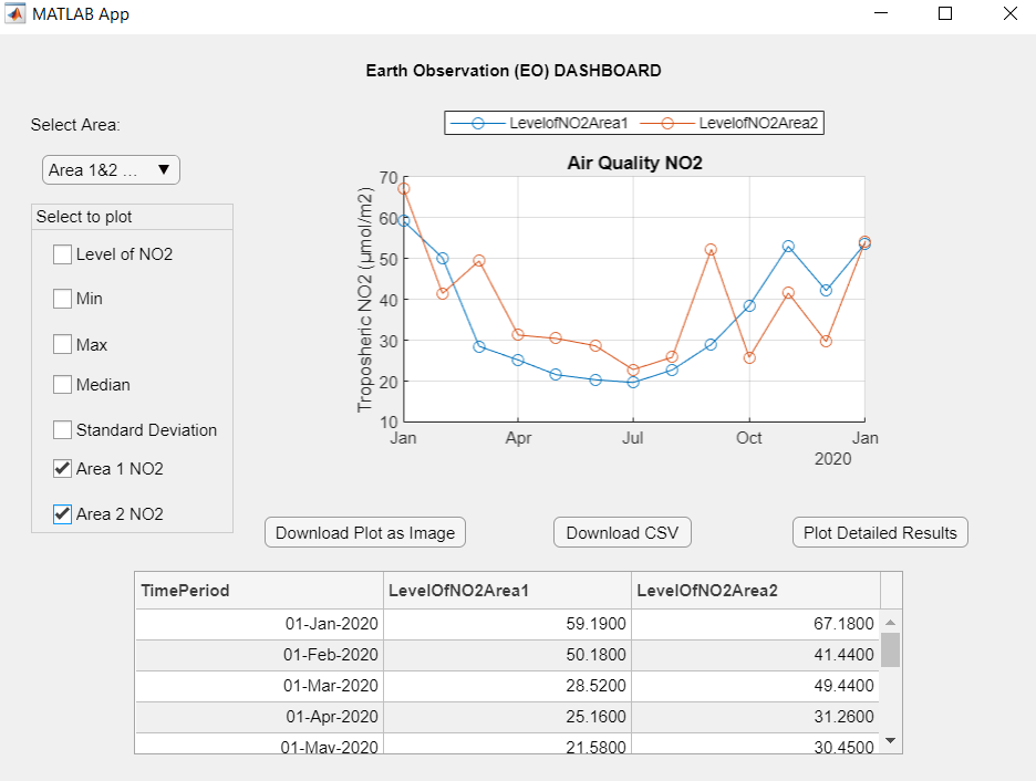
In this application, we used air quality NO2 ESA data for Los Angeles the USA, and Paris France between Mar 9, 2020, to April 19, 2021, data. Also, we used NASA data for the same two areas with different time sets which are from Jan 1, 2020, to Jan 1, 2021. All these data saved as Data 1, Data 2, Date 3, and Data 4 in Excel files shared with the application. We got the data from reading every plot and line in the air quality dashboard. That helped us as we recorded all data, we need from the website to analyze the best solution possible in this challenge. The important part of this application is data collection. This application allows the developer to put any data they want to analyze. It will work with any data for example data from satellites collected in an Excel file can be analyzed using this application. The data we connected from the EO dashboard is the only ideal example of the power of using our application. Also, the application code wrote with comments for every line of code, and easy to follow and possible to modify the application.
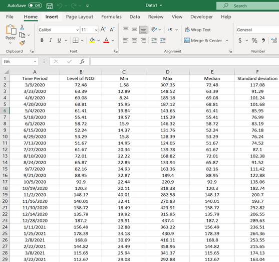
This example of the data we collected from the air quality system.
This is a demo for the project as slides.
https://drive.google.com/drive/folders/1h1hIhb8eq1Y8ed8_IQgvw2MNXaMWzVxV?usp=sharing
The application we build can be used in the EO Dashboard website. It can help the user to understand the air quality. It is easier to use the application in any area on our earth, the developer needs to connect data for every spot on the earth and users will select what they want. We build this application depend on the ideal areas selected to test the application. The video below shows how to use the application.
This is the application "MATLAB app designer File" with Excel files Data1, Data2, Data3, and Data4.
https://drive.google.com/drive/folders/18MCA7XUbxWpKM5lBU4vWWmRKcw8glgX1?usp=sharing
Earth Observation Dashboard 2021, Air Quality. viewed 29 June 2021 https://www.eodashboard.org/?poi=W1-N1
This project has been submitted for consideration during the Judging process.