Awards & Nominations

CleverChart has received the following awards and nominations. Way to go!

Global Winner
Open Science

The solution that best demonstrates the use of open science principles, which include transparency, inclusion, accessibility, and reproducibility.

Space Agency Awards
ESA ESRIN Data Award

Presented to the team that utilized ESA data most effectively to achieve the goals of their challenge.

Global Finalist

Looking at the Big Picture

The COVID-19 pandemic offered an unprecedented opportunity to look at changes in the Earth system in response to reduced human activity. Your challenge is to develop tools to better understand changes in the interconnected Earth system as seen through the EO Dashboard.

Animating the Water Quality Regional Maps, showing source contributions and deviation data

Summary

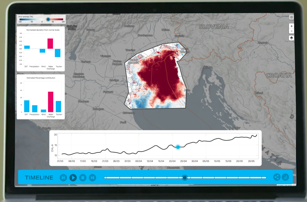
In the EO Dashboard's Water Quality (WQ) maps, a user can currently compare two distinct dates and see how the WQ differed. However, it requires unnecessary fiddling and navigation to find two dates that clearly show a trend. A more helpful solution is to animate the static images of chl-a/TSM concentrations with accompanying graphs that show the relative contribution of different source factors. This will rely on historical deviation data. In this way, the user can sit back, play the animation and clearly see at what points in time the levels were high or low, and what caused them. The user can also interact with the map, dragging a slider to different points in time.

How I Addressed This Challenge

With project CleverChart, we aim to improve the EO Dashboard so that the most useful insights regarding water quality can be drawn more quickly. With a goal of keeping things simple, we believe we brought the dashboard data to life by creating an easy-to-understand animation accompanied by useful interactive graphs. Since the challenge revolves around “looking at the big picture”, it became a necessity to look at all the potential factors that could affect water quality. This meant that our solution eventually ended up looking at factors like precipitation, water discharge, sea surface temperature, wind and tourism. The last factor, tourism, acted as a proxy for the level of human activity in a given area, including sub-factors like cruiseship pollution, human garbage and other things. 

The graphs presented in our extension relies on historical seasonal trends, and allows a user to compare a chosen year of interest to that of the historical average. The comparison can be visualized through two graphs: 1) A normalized deviation plot, showing how much the chosen factor for a given year deviates from the historical average, and 2) A line-chart showing the actual values as they fluctuate seasonally. 

In addition, the deviation values feeds into another bar-chart, which we aim will be directly useful for users that need a holistic understanding of the driving factors of water quality decline/improvement. This chart will rely on weights placed on each found contributing factor, and in combination with the deviation value, will present the estimated contribution of each factor. This can allow officials and policymakers to rapidly understand which factors to tackle first, placing potential restrictions or issuing bills to mitigate harmful factors. 

With a CleverChart extension, we hope to make the user experience of the EO Dashboard more simple and enjoyable, allowing the user to draw more helpful insights regarding underlying connections and drivers that may affect water quality. 

How I Developed This Project

Inspiration

This hackathon allowed teams to challenge themselves with one of many interesting challenges. We chose to go with water quality as it was a field some team-members were already knowledgable in. The specific information about the Chlorophyll-a concentration off the shore of Venice, Rome, was laid out in a very clear way, allowing us to understand exactly how the water quality interconnects with various surrounding factors.

Our approach to this challenge was to first brainstorm ideas on how we could improve, enhance or change the current dashboard. We had many discussions about how proposed changes could present existing data in new ways, where useful critique was given to each other. Our proposed ideas often had us do plenty of research in advance. In short, we would thus have an initial brainstorming session, take a few hours to research individually, and then brainstorm again to discuss how we could proceed. Communication is a key skill in any project, therefore everyone was in constant communication with each other using 3rd party platforms like Discord.


Tools used

The following programming languages, platforms, packages and formats were used:

  • Python
  • Euro Data Cube
  • Adobe CC suite
  • Cubase
  • pygrib
  • cdsapi
  • IPython
  • pydap
  • xcube
  • xcube_sh
  • matplotlib
  • .grib
  • .csv
  • .png


Problems and Achievements

The majority of our ideas suffered from one of three problems. The first problem was that some ideas were not possible. This was either because it had never been done before or that the required data was not available. The second problem was to do with time constraints. The hackathon only lasts for 7 days, which wasn't sufficient for some of the proposed ideas.The third and last problem we encountered were knowledge gaps, which prevented us from pursuing certain ideas.

Achievements made were mostly to do with the available data. We firstly managed to successfully fetch relevant data and manipulate it so that it was useful. We also managed to find relevant and credible external data that aided us in developing our idea. We also think that we achieved to produce a great final extension that could hopefully come to use for EO Dashboard users.

How I Used Space Agency Data in This Project


The data presented is mainly taken from JAXA and ESA satellites. Using chl-a/TSM Water Quality Regional Maps from JAXA, static PNG images were first collated to produce an animation that shows the temporal and spatial evolution of chl-a and TSM. This may offer the advantage of faster data retrieval for the user, as a single animation must be fetched as opposed to continuous requests for specific dates.

Furthermore, the bar-charts presented in the left pane relies on historical data for different factors. Such factors include precipitation, Sea Surface Temperature, wind and others. The charts uses the main concept of deviation. By investigating the historical average of a given factor, it’s possible to compare the values for a chosen year of interest with that of the historical average. Due to seasonal variations in levels of a given factor, it’s not particularly informative to only look at the measured level. For instance, assuming that low wind levels could be a cause of chl-a decline in a lockdown period fails to recognize that wind levels might generally be low in the summer periods regardless. It is therefore more informative to see if any deviation has occured away from a factor’s expected seasonal value. In this way, a user can compare the relative deviations of each factor, which should be helpful to understand potential drivers of chl-a/TSM increase or decrease.

Additionally, the most helpful thing for a potential policymaker is to directly see what may have caused, say an algae bloom, and by what percentage it contributed (bottom graph in left-side pane). Despite a given factor deviating by a large amount for a particular year, it might not mean that its influence on an algae bloom is equally great. In other words, different factors may have different weights. Finding these weights might be a difficult task, but the results from numerous research papers could help inform how these weights should be set. For example, one research paper finds that light intensity had a greater impact on algae bloom than water temperature (Wang, Wang, Wang and Zhang, 2015). Another finds that certain ratios of Nitrogen and Phosphorus are more optimal for algae bloom (SMITH, 1983)

Lastly, the actual chl-a/TSM levels are fetched from JAXA’s GCOM-C, displayed in a graph near the bottom timeline, with a slider indicating at what point in time the animation has reached.

Earth Observing Dashboard Integration

In order to integrate our solution into the EO Dashboard, the following things must be considered:

1. Add code scripts to dashboard application

At the moment, a set of Jupyter Notebook scripts collect historical data from various space agency data sources. The notebooks are currently run in the EOxHub workspace, where a majority of data files come in .grib format. Other formats include .csv and PNG. For integration, the relevant code snippets of the scripts must be copied and tailored to the Vue-based dashboard application. This could either be in the form of Python scripts or JavaScript files that communicate with front-end Vue components. For purposes of speed, some of the data needed will be cached locally or stored on Github (as the Dashboard currently does), but the files would also at regular time-intervals make requests to remote servers that themselves will be populated with updated indicator data at regular intervals. These requests could be API requests and need to happen automatically. An example would be the regional maps showing the distribution of chl-a/TSM. Since our solution relies on an interactive animation, the animating component (e.g. python library) will need to seamlessly add newly processed images to the stock, as and when they become available from the satellites. Furthermore, since our solution computes historical monthly averages for various factors, many of the plots must be recomputed monthly/yearly to reflect the newest data. It is also important to note how a sliding window may be more effective for certain graphs, as global warming and other long-term factors may change the average historical values in a way that make the deviation plots less useful. While the application should be built to allow for live asynchronous requests and recomputations, any required downtime should be scheduled to happen overnight. In terms of operability with Vue, the scripts would take advantage of Vuex store for persistence of data as the user navigates around. This is critical for our extension, as it allows all the necessary components to be reactively updated in line with the changing timestamp-value in the vuex store.

2.Scaling

While it seems very possible to integrate our solution in a way that allows a user to define an Area Of Interest and get corresponding data, a more realistic integration is through a utilization of the existing features of the dashboard. For water quality in particular, this means that the pre-chosen locations will be kept, but in a similar way to how it already works, the user’s choice of location must be sent to the relevant RequestHandler function that pulls up either chl-a or TSM data for that specific location. It is in our extension’s ability to handle requests from different locations that scaling is meant to be demonstrated.

3. Research about factor contribution weights

Our solution has been fully developed conceptually and partly developed physically. Notebooks that fetch relevant data already perform the data cleaning and processing required, as well as display them as matplotlib bar charts (see Github repository below)

Github code:

https://github.com/davidvonhuth/EO-Dashboard-Challenge

However, the bottom left bar chart relies not only on the deviation values from the top bar chart, but also on weight estimates. In order to make this chart somewhat useful for dashboard users, it must be as accurate as possible. With numerous weather stations, satellite data and oceanic-related environmental research papers, it seems possible to compute rough estimates for factor weights. As described in the section “How did you use space agency data in your project”, some research papers already discuss this. Further research is required to make accurate weight estimates, preferably with the aid and consultation of environmental experts. The final extension layout should however indicate clearly that the estimates are only speculative, and should not be taken at face-value. 

Data & Resources

Data resources:

  1. https://cds.climate.copernicus.eu/cdsapp#!/dataset/reanalysis-era5-land-monthly-means?tab=overview
  2. https://www.bafg.de/GRDC/EN/Home/homepage_node.html
  3. https://collections.eurodatacube.com/s5p-no2-tropno-daily-check/
  4. https://eodashboard.org/?indicator=N3b&poi=IT6-N3b
  5. https://eodashboard.org/?indicator=N3a2&poi=NorthAdriatic_JAXA-N3a2
  6. https://www.e-unwto.org/doi/abs/10.5555/unwtotfb0380010020152019202011


Research papers that support our developed idea:

Long, T., Wu, L., Meng, G. and Guo, W., 2011. Numerical simulation for impacts of hydrodynamic conditions on algae growth in Chongqing Section of Jialing River, China. Ecological Modelling, 222(1), pp.112-119.


Onderka, M., 2007. Correlations between several environmental factors affecting the bloom events of cyanobacteria in Liptovska Mara reservoir (Slovakia)—A simple regression model. Ecological Modelling, 209(2-4), pp.412-416.


Chen, S., Chen, X., Peng, Y. and Peng, K., 2009. A mathematical model of the effect of nitrogen and phosphorus on the growth of blue-green algae population. Applied Mathematical Modelling, 33(2), pp.1097-1106.


Kessouri, F., McWilliams, J., Bianchi, D., Sutula, M., Renault, L., Deutsch, C., Feely, R., McLaughlin, K., Ho, M., Howard, E., Bednaršek, N., Damien, P., Molemaker, J. and Weisberg, S., 2021. Coastal eutrophication drives acidification, oxygen loss, and ecosystem change in a major oceanic upwelling system. Proceedings of the National Academy of Sciences, 118(21), p.e2018856118.


Wang, C., Wang, Z., Wang, P. and Zhang, S., 2015. Multiple Effects of Environmental Factors on Algal Growth and Nutrient Thresholds for Harmful Algal Blooms: Application of Response Surface Methodology. Environmental Modeling & Assessment, 21(2), pp.247-259.


SMITH, V., 1983. Low Nitrogen to Phosphorus Ratios Favor Dominance by Blue-Green Algae in Lake Phytoplankton. Science, 221(4611), pp.669-671.


Video resources:

The background-videos were sourced from https://www.pexels.com/, a free-to-use stock service.


Special thanks

-To the creators of the EO Dashboard hackathon as well as the Subject Matter Experts, who provided relentless guidance and support throughout the hackathon

-To the content producers of pexels.com who contribute with royalty free imagery and videos to the wider public.

-To Natan Rubinshtein, for continuous support and inspiration as a friend of the team

Tags

#water quality #looking at the big picture #Animation #Charts #Eutrophication #Covid-19 #chl-a #tsm

Judging

This project has been submitted for consideration during the Judging process.