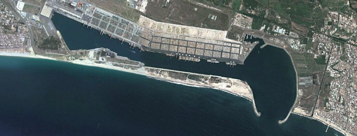
Everyone knows that Italy was the worst hit country by the Covid-19. Therefore we begin our research with data from the Gioia Tauro region of Italy.
 The pandemic restrictions and the related economic crisis have highly impacted the pollution level in different areas of Europe and of the world. Although this fact has been widely demonstrated, this specific analysis aims to look jointly at different sources of pollution and the NO2 level computed from Sentinel 5P satellite and to analyse how the trend varied between 2019 and 2020.
Following this grap, we analyse the NO2 gas for air quality in the Covid-19 Era.
- This graph is between boat and NO2 gas.
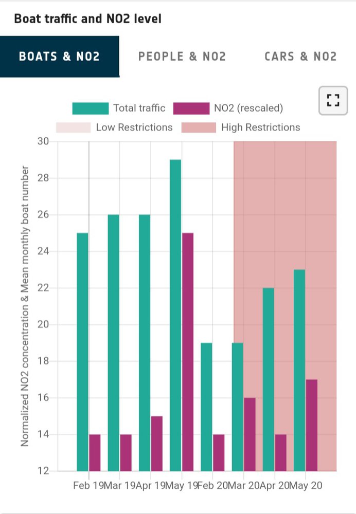
- What we can understand from the following graph is that the total traffic increases during the period of low restriction. At the same time the graph shows that NO2 emissions are high. Thus the amount of total traffic decreases during high restriction. At the same time NO2 emissions are low.
- Therefore we can perceive that vehicles release so much NO2 gas to our environment which affects our air quality.
- In this case, it shows us most of the boats release green house gases.
- We have to improve stimulator converter to boats which converts NO2 gas to N2 gas.
- We have to come up with laws to make it mandatory to fit the booster converter in boats.
- It will help to protect our environment and ocean.
This graph is between people and NO2
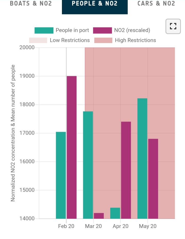
- What we can understand from the following graph is that the total people in port during the period of low restriction. At the same time the graph shows that NO2 emissions are high.
- Thus the amount of total people in port increases during high restriction. At the same time NO2 emissions are low.
- Therefore we can perceive that people in port use to much non-eco-friendly and release so much NO2 gas to our environment which affects our air quality.
- In this case, it shows us when most of people in port which release green house gases.
- We reduce to use green house gas emissions works and we have to use converter for eco-friendly.
- We have to come up with laws for protect our ocean and air quality.
This graph is between Cars and NO2
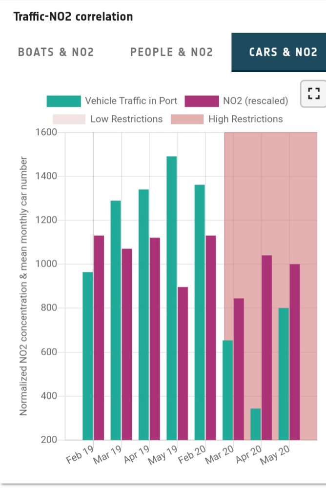
- What we can understand from the following graph is that the total vehicle traffic in port during the period of low restriction. At the same time the graph shows that NO2 emissions are low than vehicle usage.
- Thus the amount of total vehicle traffic in port decreases during high restriction. At the same time NO2 emissions nearly same in low restriction time, at the same while, vehicle traffic in port is low then low restriction.
- From thus graph, we can clearly understand that vehicles do not release any green house effect gases. Because, they have stimulator converter.
Following these graphs we analyse Economic on the Covid-19 Era.
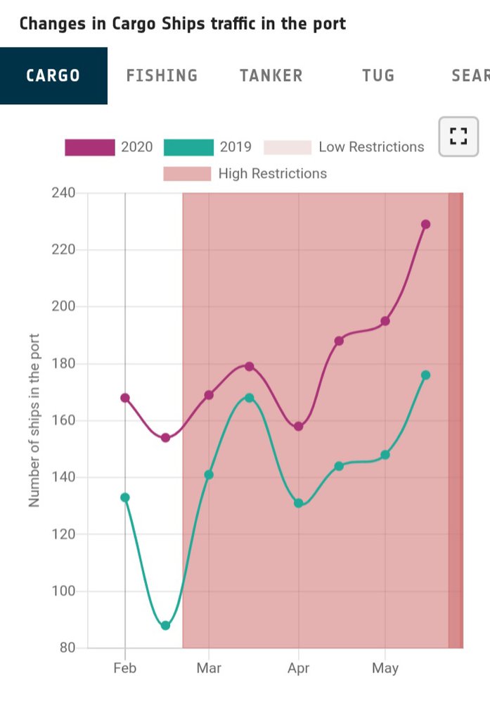
- We already know cargo ships are very important transport via ocean which are increase a country's economic and they raise income.
- Following this graph, the cargo ships traffic in the port increase in 2020 more than 2019. At the same while, if we compare restriction time, number of cargo ships raise in high restriction time in both years.(2019&2020)
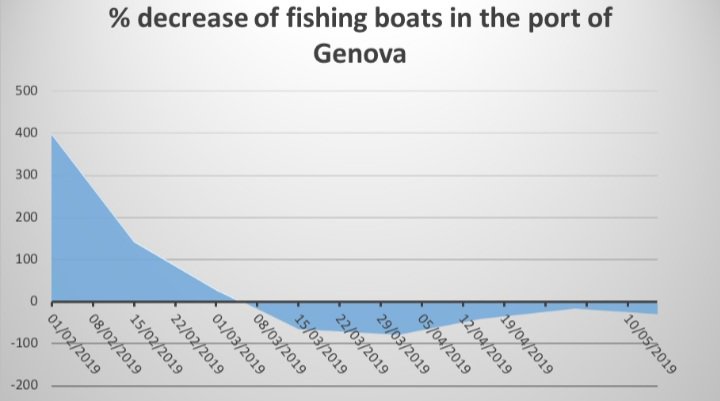 This graph shows that the percentage decrease the fishing boats for the port of Genova. It is evident that, because of the restriction after the end of February, the number of boats in the port of dropped in 2020, with respect to 2019. The same trend is evident also for pleasure boats.

This graph shows how to decrease of pleasure boats in the port of Genova, in 2020.
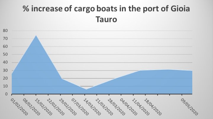
The Port of Gioia Tauro, instead, showed in 2020 an increase in the number of cargo boats, although the Covid-19 still impacted the very positive trend which characterized the first two months of 2020.
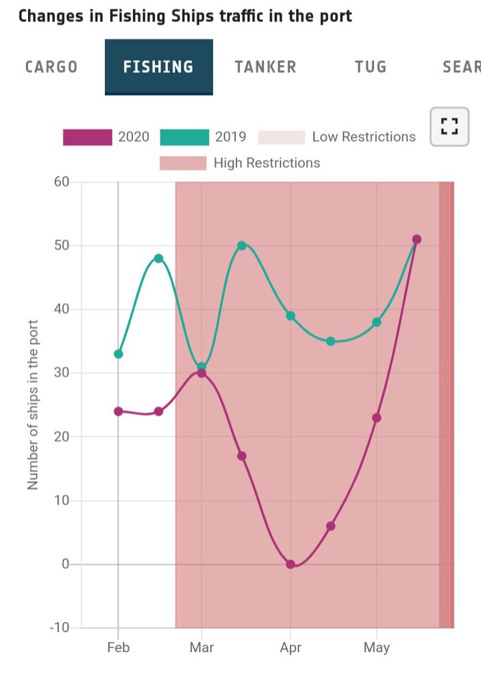
- What we can understand from the following graph is that the fishing ships traffic in the port increases during the period of low restriction in 2019 more than 2021.Thus the amount of the fishing ships traffic decreases during high restriction.
- Therefore we can perceive that economy is very low in 2021 high restriction.
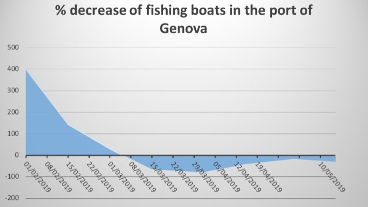
This graph shows decrease of fishing boats in the port of Genova, in 2019.
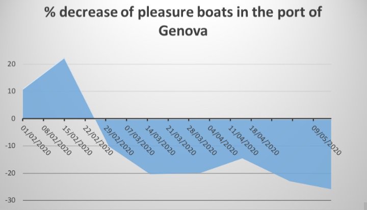
This graph shows decrease of pleasure boats in the port of Genova, in 2020.
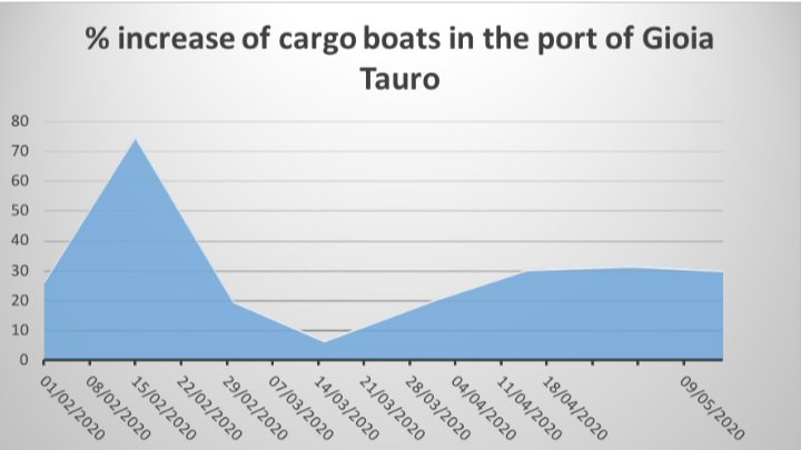
This graph shows increase of cargo boats in the port of Gioia Tauro, in 2020.
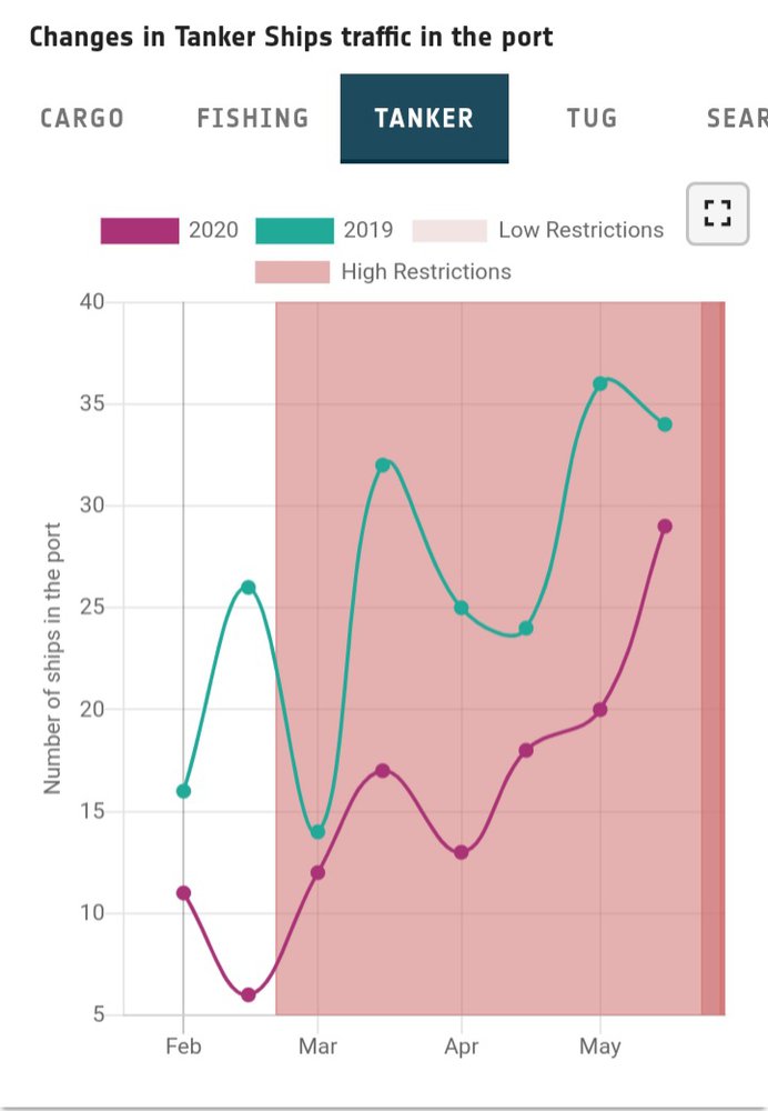
- What we can understand from the following graph is that the tanker ships traffic in the port decreases during the period of low restriction in 2019 then 2020.
- Thus the amount of the tanker ships in the port increases during high restriction in both year.
- Therefore we can perceive that the tanker ships have used in high restriction period in 2019 and 2020.
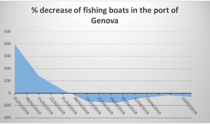
This graph shows that decrease of fishing boats in the port of Genova, in 2019.
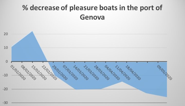
This graph shows that decrease of pleasure boats in the port of Genova, in 2020.
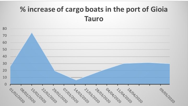
This graph shows that increase of cargo boats in the port of Gioia Tauro, in 2020.
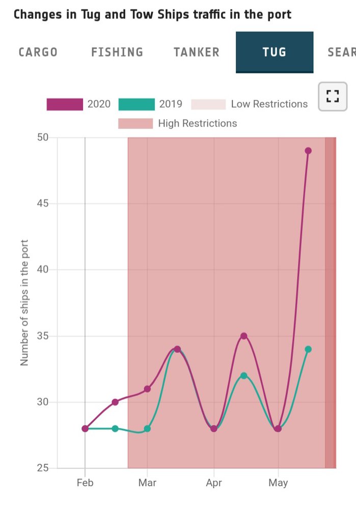
- What we can understand from the following graph is that the tug and tow ships traffic in the port decreases during the period of low restriction in both years.
- Thus the amount of tug and tow ships traffic in the port increases during high restriction. At the same time in 2021 tug and tow ships traffic raise more than 2019.
- We can perceive that in the middle of the March and beginning of April and May tug and tow ships traffic are equal.
- In this case, it shows us tug and tow ships traffic use highly after May in 2020.
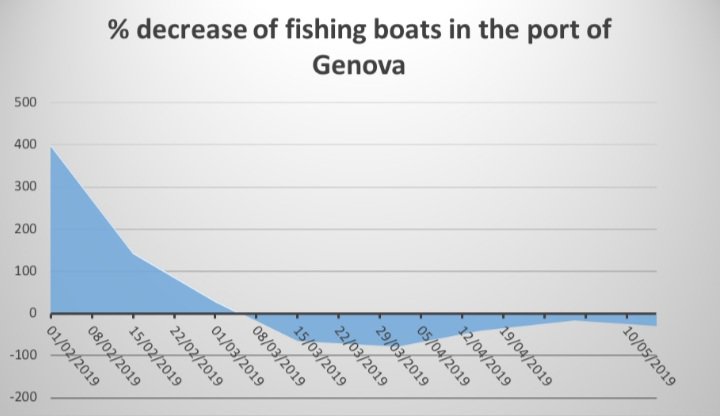
This graph shows that decrease of fishing boats in the port of Genova, in 2019.

This graph shows that decrease of pleasure boats in the port of Genova, in 2020.
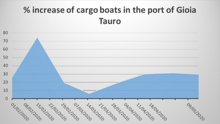
This graph shows that increase of cargo boats in the port of Gioia Tauro, in 2020.
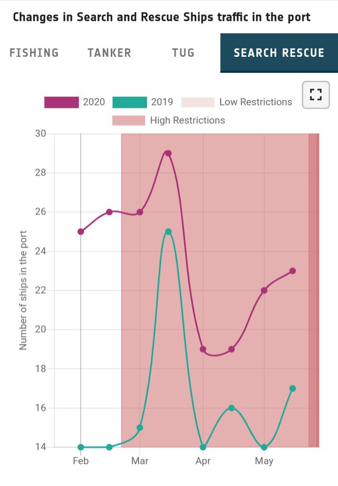
- What we can understand from the following graph is that the search and rescue ships traffic in the port decreases during the period of low restriction in 2019 more than 2020. At the same time the graph shows that in Feb the search and rescue ships traffic in the port doubled in 2020.
- Thus the amount of search and rescue ships traffic in the port increases during high restriction. At the same time in the middle of the March the search and rescue ships traffic in the port suddenly raise in 2019.
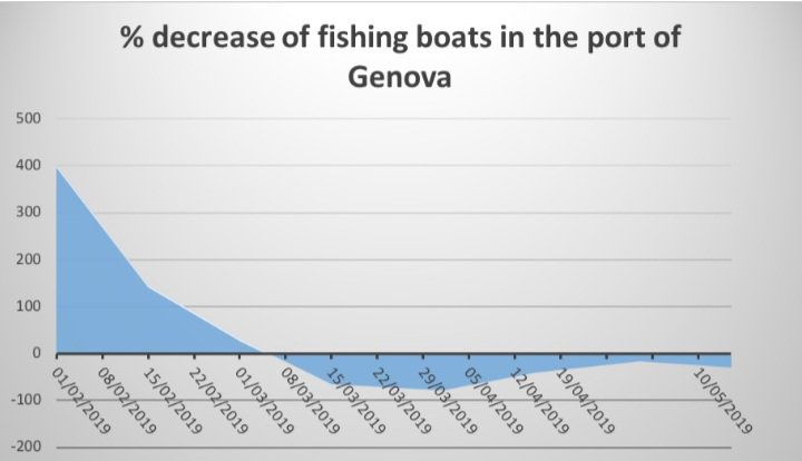
This graph shows that decrease of fishing boats in the port of Genova, in 2019.

This graph shows that decrease of pleasure boats in the part of Genova, in 2020.
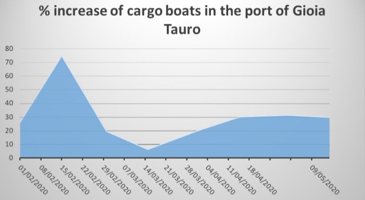
This graph shows that increase of cargo boats in the port of Gioia Tauro, in 2020.
Following this graph shows that Agriculture during the Covid-19 Era.
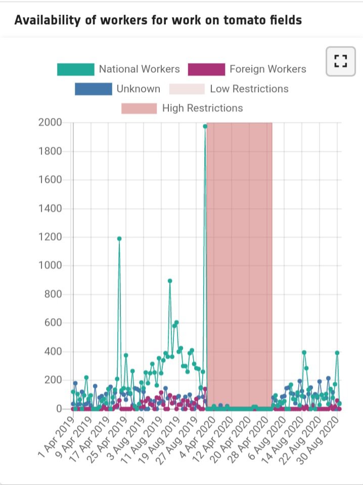
- This graph takes from Apulia, Italy about Agriculture workers from a tomato field.
- On April,2019 to Aug 2019 is low restriction period which days many national workers work in this period. Number of foreign workers and unknown are nearly equal at the same while, low than national workers.
- On 4th of April 2020 to 28 th of April 2020 is high restriction period which time national workers, foreign workers and unknown are zero level.
- After this period, start low restriction and number of national workers, foreign workers and unknown are equal but not high.
This graph takes from Cassino, finished good production: output inventory level.
- January to March and November to December are low restriction periods, on that time, Good productions increase highly than in 2020.
- March to November is high restriction time. On that period, Good production is little high than in 2019.
Following this graph shows that water quality during Covid-19 Era.
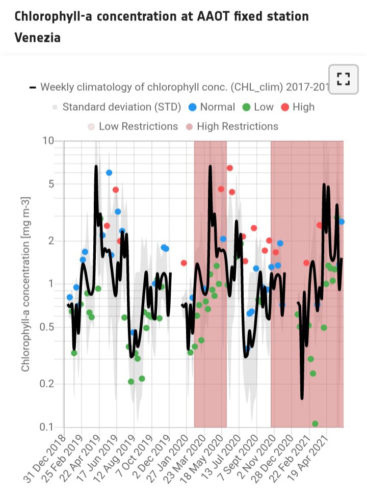
Chlorophyll-a concentration mostly use to identify water quality. This data takes from Venice Lagoon, Italy.
- The water quality analyses focuses on assessing the effect of the lockdown and the subsequent economic recovery on inland and coastal water quality by monitoring the deviation from a climatological mean of Chlorophyll-a concentration over a number of key Areas of interest.
- Green dots - lower than the climatological mean (in black), indicating good water quality.
- Blue dots - Greater than the climatological mean but still inside the climatological variability, indicating regular water quality.
- Red dots - beyond the climatological variability, indicating poorer water quality.
From this graph, we can perceive, in high restriction time, the Chlorophyll-a is low than low restriction time.
Following this graph shows that health indicator from UK(United Kingdom)
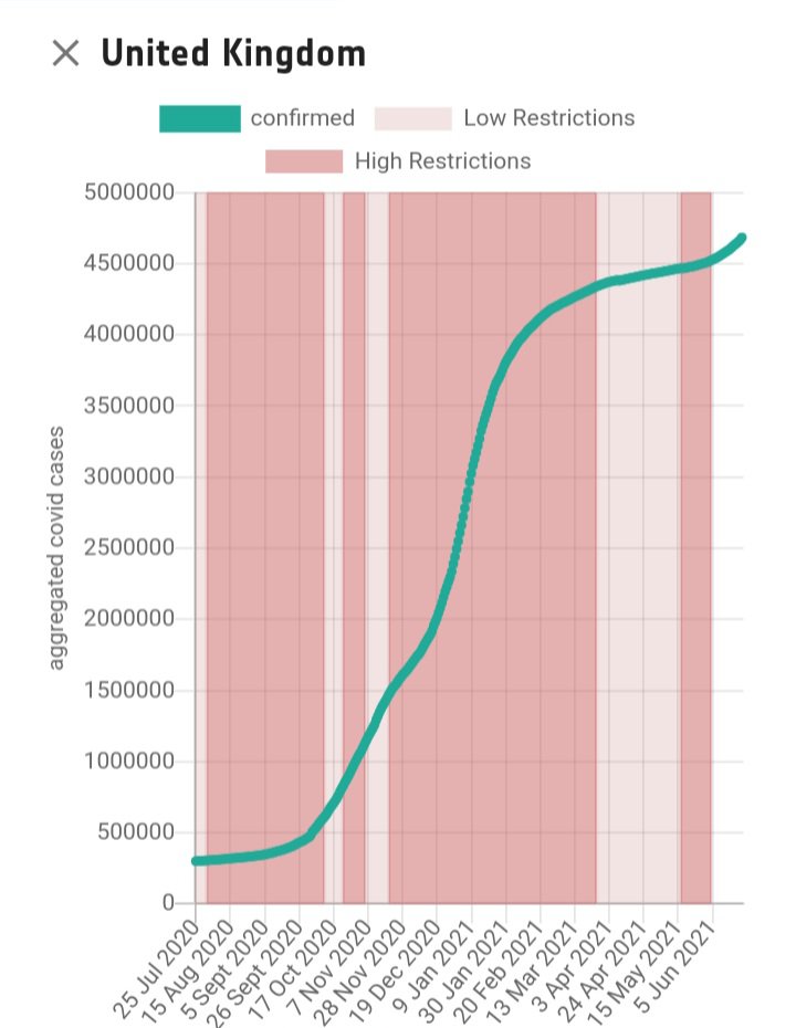
This graph shows covid 19 cases in United Kingdom. Covid-19 cases are raising highly in low restriction than high restriction.
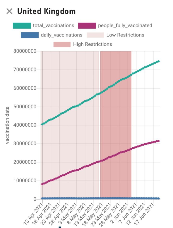
This graph shows Covid-19 vaccination on United Kingdom.
Total vaccination and people fully vaccinated are continuously raising.