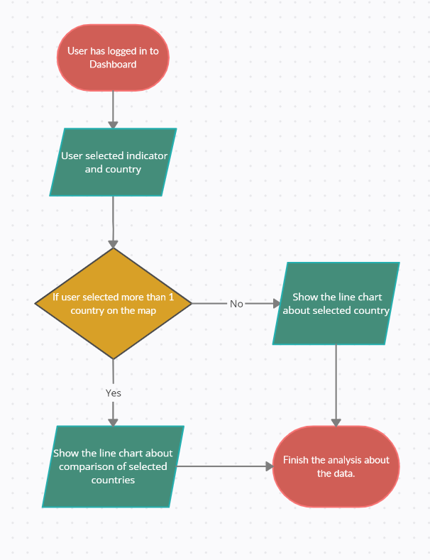
A Comparative Analysis

The COVID-19 pandemic has had different impacts in different regions of the world. Your challenge is to perform a comparative analysis of the pandemic’s economic impacts in urban areas for the USA, Asia, and Europe using the EO Dashboard.

Comparative Line Graph Representation of The Mobility Analyzes of Major Cities on Different Continen

Summary

We decided that we wanted to develop the datas in the website so people can reach solutions from those datas more easily. The countries that we choose are the USA, Belgium and Japan. In the “eodashboard.org”, there was some datas for different countries that are called “mobility datas”. In these mobility datas there were some subtitles. First of all, we examined these datas throughout the covid process. Then, we put this review into writing.The next step we have taken was to create our own whole new and original line charts. We have brought the website a whole new perspective. In our own line charts, we compared the three countries that we have chosen while using the mobility datas.

How I Addressed This Challenge

Here is our line charts: https://docs.google.com/document/d/1BgTR1Vh2vhkhmB7dDeBxyyeJFBEjDTbSLvOCSL6FT14/edit?usp=sharing

As team Yakamoz we wanted to make some important deductions about covid 19 and how it affected the world. So for implementing our goal, we used the datas from the website called “eodashboard.org”. When we first started our project, we wanted to compare the datas in the website and make some deductions about them. We chose three big countries to examine them. Three countries that we chose to examine are Japan, USA and Belgium. The reason we chose these countries to do our project is we wanted to reach datas from countries that are in different continents. From the website “eodashboard.org” we compared the mobility datas in Japan, USA and Belgium during the covid process. Thanks to that, we saw how covid 19 affected the countries mobility datas. After doing so, as team Yakamoz we wanted to develop the charts that are in the website. We compared one mobility data for three different countries and we created some whole new and original line charts for them. Our project is really important because we created new line charts for the website and we developed the resources we can find in it. We hope to achieve that people will have to spend less time while figuring out how the covid process affected different continents and understand the datas much easier.

How I Developed This Project

While we were reviewing the website of the competition as a team, we were very excited and started looking for the competition that was suitable for us. While examining the website, we saw that we could access the data of the countries specifically, and we thought that we could compare and evaluate the mobility data of the countries with the help of line graphs. Examining similar studies inspired us in this regard. The way we handled this project was to look at the data in the Earth Observing Dashboard from a different perspective and interpret them in different ways. We used an application called infogram to graphically express the data we had during the development phase of our project. Infogram is an infographic and chart maker. Create and share infographics, online reports, and interactive maps. Also during the project development time we use google calculator in order to take the average of the data we have on a monthly basis and to check the accuracy of the results we found. During the project development process, as a team, we gained the ability to correctly interpret the data we have, to express the data in different ways, to approach problems from different perspectives, to read graphics and to work as a team. Our strong points as a team may be that our time to get used to the process is longer than experienced teams, since we have not participated in any project on data analysis and processing before, but since all of our team members have participated in national and international projects before, our adaptation process and Our project skill was high.

How I Used Space Agency Data in This Project

In this project our team mission is to evaluate the mobility status of the big cities in 3 different continents in the cavid 19 process by using the data of Earth observing Dashboard and to compare them with each other.For this reason, while preparing our project as a team, we benefited from the resources prepared by NASA and its partners in this project, esa and jaxa, and presented the obtained data from a different perspective.Using the resources prepared by NASA and its partners allowed us to be sure of the reliability of the resources we used while doing our project and enabled our project to focus on various areas.

Project Demo
Earth Observing Dashboard Integration

According to our research about the technical background of the Earth Observing Dashboard, we saw that we could integrate our solution to the dashboard. Firstly, we developed an algorithm (Algorithm is attached below.) that will specify the way we will apply our solution to the dashboard. In our algorithm, the way to access data that has been compared is really simple. Here are the steps of our algorithm: 1- Users should log in to the dashboard. 2- Users will select an indicator and country/countries. 3- If they selected more than one country on the map, they will see a comparison line chart of data about the countries that they have selected. Else, they will see a line chart about the selected country. 4- Users finish the analysis of the data.


Data & Resources

 As a team, we benefited from the resources NASA and its partners gave us during the development phase of our project. We also benefited from different articles and publications in order to increase the diversity of the project. Obtaining information by using different publications made our project easier and increased the reliability of the project.


Tags

#interconnectedearthsystemimpact #acomparativeanalysis #mobilitydata #covid19 #pandemic #grocery #parks #residential #transitstation #retailrecreation #linechart

Judging

This project has been submitted for consideration during the Judging process.