Awards & Nominations
Revilky has received the following awards and nominations. Way to go!

Revilky has received the following awards and nominations. Way to go!

The COVID-19 pandemic has had different impacts in different regions of the world. Your challenge is to perform a comparative analysis of the pandemic’s economic impacts in urban areas for the USA, Asia, and Europe using the EO Dashboard.
The COVID-19 pandemics affected the Economy of many countries causing many troubles in their economic system. A comparative analysis was done between some continents taking their major countries, for example, the USA, France, and Japan before and after COVID-19 in two different criteria, economic impacts and air quality.For example, more than one billion passengers in the USA were removed representing a decline of 64.4% of global passenger traffic due to COVID-19.In France, the amount of NO2, NO, and CO levels in the air, were reduced by 67%, 78%, and 62%, respectively, resulting in an 80% reduction in road traffic.
First and foremost, We developed a mobile application and a website working on a comparative analysis between the economic impacts of COVID-19 in different nations in a creative and distinguished way by using visualization and analytical data.
In addition, this comparison would allow diverse audiences to interact and make use of the other data in an easy way. The countries that were negatively impacted economically as a result of the pandemics might simply make use of the non-affected countries as a guide for improvement. They can get benefit from those countries in terms of how they adhered to safety precautions while also avoiding a drop in their GDP.
Therefore, I hope that the project achieves an easy, clear, and engaging manner of presenting the data, so that everyone, not only specialists in this field, can effortlessly understand the facts and statistics.
We have chosen this specific challenge because we have a passion for economics and wanted to know more about what happened in the economy after the COVID-19 pandemics. So, we found that with the data provided in the EO dashboard, we can compare easily the economy of different countries after the pandemics and get benefited from this information.
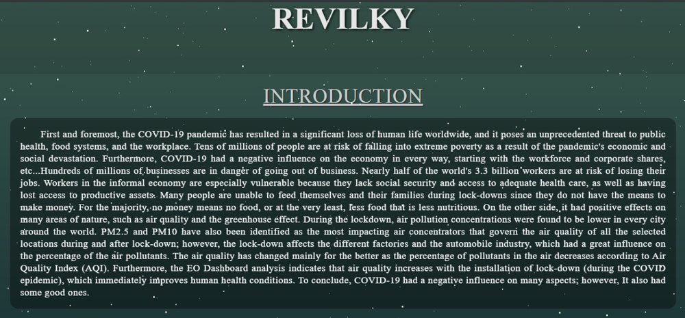
These photos are sample of our website:


We have used the EO dashboard to get the data from it and it really helped us in our project and our success. The data in the EO dashboard is simply categorised and shown, and we used some of the information and data from it that aided us in our project.
Presentation link (includes the links of website and app):
https://docs.google.com/presentation/d/1L0mmIjSMhCyW_zOD5PqoC2yZ8iEa_KFjTTBrD1J6BxA/edit?usp=sharing
We made use of the EO dashboard by not only gathering a wealth of information but also incorporating their graphics into our website. As a result, our solution has become integrated into the EO dashboard.
EO dashboard, OSM, OSM overpass API.
This project has been submitted for consideration during the Judging process.