Awards & Nominations
World MAQI has received the following awards and nominations. Way to go!
 Technology

The solution that develops an innovative technical approach and is equipped for integration into the EO Dashboard.

World MAQI has received the following awards and nominations. Way to go!
The solution that develops an innovative technical approach and is equipped for integration into the EO Dashboard.
The EO Dashboard is derived from a suite of different satellites from the EO observation (EO) programs of the three collaborating space agencies: NASA, ESA, and JAXA. Your challenge is to devise a way to visually fuse information from diverse Earth observation datasets of different missions.
Mobility over Air Quality Index (MAQI) is a measurement derived from fusing Mobility statistics provided by Google with air quality data from Earth Observations (NO2) as a means of measuring mobility and the impact to Air Quality. While the COVID-19 pandemic led to a decrease in mobility, resulting into cleaner air, MAQI fuses the data to provide a visualization that proves the hypothesis. With MAQI, areas that have recovered mobility without negatively affecting air quality can be detected.We do not need a pandemic to have cleaner air. With MAQI, we can breathe new life into research for a cleaner and greener world.
It has been hypothesized that Air Quality has improved during lockdowns imposed in places around the world during the COVID-19 pandemic (Wilder-smith & Freedman, 2020). One of this could be attributed to the fact that there is less mobility as a result, which led to a decrease in Air Pollution or NO2 pollutants. While several studies (Sannigrahi et al.,2021)(Cárcel-Carrasco et al., 2020)(Muhammad et al., 2020) have indicated such observations, there is a need to visualize such observations with data obtained through EO Dashboard.
Given that mobility and air quality can be viewable separately, it is very difficult to relate the trends involving both together. The solution to this is to provide a methodology to fuse information obtained regarding mobility and air quality to give a visual demonstration regarding how mobility can indeed affect air quality. The said visual story should also be viewable and easy to visualize and integrate with the EO Dashboard provided to benefit future researchers in the field of environmental sustainability, climate change, and fields that focus on improving air quality for the betterment of human life.
Thus, MAQI (Mobile Air Quality Index) was developed to solve the aforementioned problems.
MAQI provides a representational measurement derived from Mobility and Air Quality data that displays a visualization of how Air Quality is affected by human mobility. This will allow the detection of places that have recovered mobility during the easing of lockdowns in the COVID-19 pandemic that had a minimal negative effect on the air quality in their area.
This visualization can give the following benefits:
We’ve chosen to focus on Air Quality (NO2) and Google Mobility data. Logically movement and transportation could impact air pollution levels. During the COVID-19 lockdowns, communities all over the world experienced dramatic drops in mobility and improved air quality. Now that countries are recovering from the pandemic lockdowns, mobility is coming back and air quality is deteriorating again.
Although mobility and air quality data are viewable separately on the EO Dashboard, it is not easy to relate these trends against each other.
Our challenge is to devise a way to fuse information from mobility and air quality datasets together in an interactive way that can tell the story of how mobility affects air quality and also detect which areas are recovering their mobility without generating more pollution.
 Development
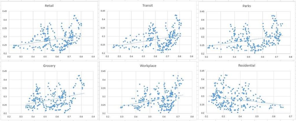
MAQI combines various mobility indicators from Google with Tropospheric NO2 to generate an index of mobility against air quality. By combining these indicators, we can get a gauge not just of how mobility is recovering post-pandemic, but also whether an area is generating more or less NO2 relative to the mobility being measured.
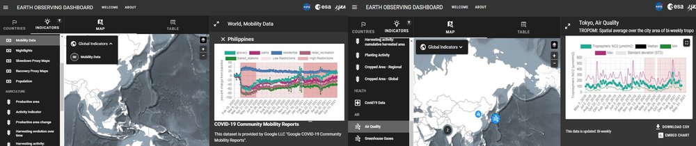
We downloaded COVID-19 Community Mobility Reports for a 1-year period from Google. We decided to go for regional disaggregation since the country level is only available in the Earth Observing Dashboard.
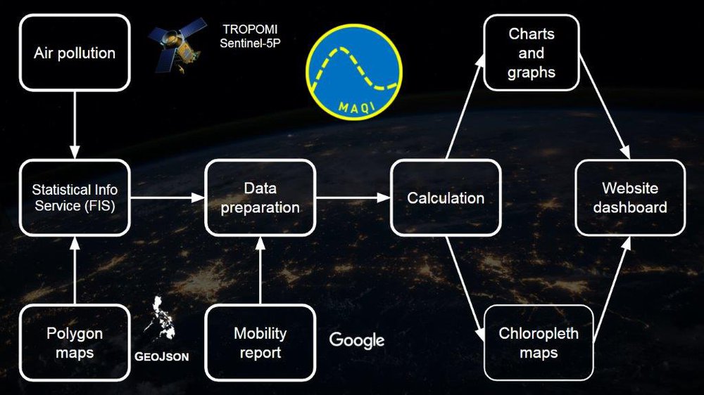
To align the spatial coverage, we defined polygons using GeoJSON on the Sentinel EO Playground and Statistical Info Service (FIS) API's to extract nitrogen dioxide (NO2) time-series from the Sentinel-5 Precursor mission for those polygons.
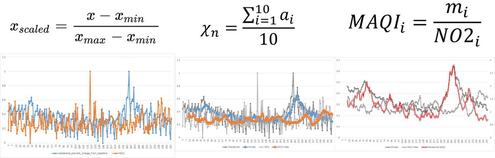
To align temporal coverage, although both mobility and NO2 data were available daily, there were some days when NO2 had missing values. For these cases, we substituted the most recent value for NO2 to complete the dataset.

To make the data comparable, we implemented Min-Max scaling for both the mobility and NO2 indicators.
We then created indices by smoothing both indicators using a 10-period moving average to remove the random fluctuations and see a more consistent trend.
We divide the mobility index by the NO2 index to create our MAQI value.
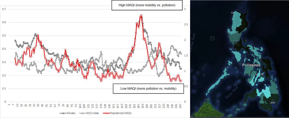
MAQI brings a better understanding of the air quality trends. When MAQI is high, it means societies are generating more movement compared to pollution. When MAQI is low, it means pollution is getting ahead of mobility. We are looking to visualize the regional disaggregated data of MAQI on the EO Dashboard, to make it possible to benchmark the MAQI performance within countries, and show which areas are recovering post-pandemic but keeping pollution in check. Since disaggregated mobility and NO2 data are available for all countries, MAQI can easily be adapted for use for any country or location.
In summary, this is how we used satellite data and mobility report to calculate mobility over air quality index and show trends and visualizations.
We studied each mobility metric and they have distinct effects and relationships with NO2. This can provide the foundation of doing more detailed multi-variate models of NO2 driven by mobility.
https://www.esa.int/Applications/Observing_the_Earth/Copernicus/Sentinel-5P/Tropomi
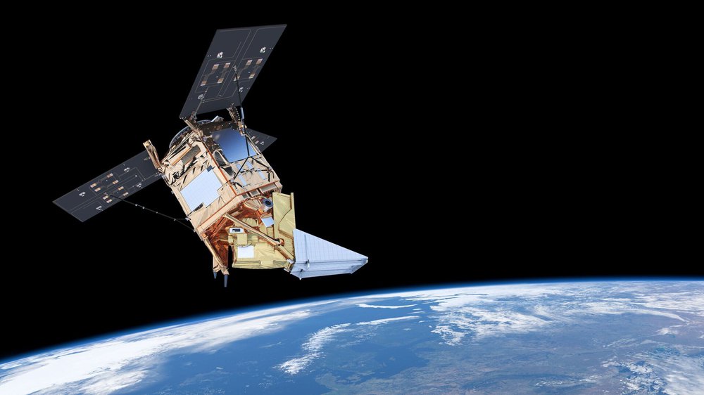
Jointly developed between the Netherlands Space Office and the European Space Agency (ESA), the Tropospheric Monitoring Instrument (TROPOMI) is an advanced multispectral imaging spectrometer to detect different gases in the atmosphere. Particular interest are gases which is known to be pollutants and harmful to humans. The instrument is aboard the Sentinel-5 Precursor of the Copernicus Programme. TROPOMI uses ultraviolet (UV), visible (VIS), near (NIR) and short-wavelength infrared (SWIR) to monitor ozone, methane, formaldehyde, aerosol, carbon monoxide, nitrogen dioxide, and sulfur dioxide in the atmosphere.
We are using nitrogen dioxide values to represent air pollution for this hackathon.
https://www.sentinel-hub.com/explore/sentinelplayground/
Sentinel Playground provides easy-to-use discovery and exploring of full-resolution satellite imagery.
https://www.sentinel-hub.com/develop/api/ogc/fis-request/
The Sentinel FIS, performs elementary statistical computations — such as mean, standard deviation, and histogram approximating the distribution of reflectance values — on remotely sensed data for a region specified in a given spatial reference system across different bands and time ranges.
https://eodashboard.org/?indicator=GG&poi=GG-GG
The EO dashboard combines the resources, technical knowledge and expertise of the NASA, ESA, and JAXA to strengthen our global understanding of the environmental and economic effects of the COVID-19 pandemic.
We can integrate on 2 levels:
air, air quality, atmosphere, gas, Google, lockdown, mobility, movement, nitrogen dioxide, Philippines, pollutant, pollution, Sentinel, visualization
This project has been submitted for consideration during the Judging process.