Multi-Mission Earth Observation Data Visualization

The EO Dashboard is derived from a suite of different satellites from the EO observation (EO) programs of the three collaborating space agencies: NASA, ESA, and JAXA. Your challenge is to devise a way to visually fuse information from diverse Earth observation datasets of different missions.

BROTHEREYE - A visualization and demonstration website for NASA NEO and USGS datasets

Summary

BROTHEREYE a tool that can be used by educators, researchers or any inquisitive individual for literally viewing the world from a different perspective. BROTHEREYE uses NASA NEO, Copernicus, MODIS and Landsat which can be easily viewed, analysed and used to discover hidden facts by monitoring our home planet. In order to visualize the data in an interactive manner, BROTHEREYE uses Openlayers so that the users can get a vivid display and play with the datasets at the same time.

How I Addressed This Challenge

BROTHEREYE is a fun data visualisation tool that uses data obtained from NASA Earth Observations, MODIS, Copernicus Landsat and USGS. BROTHEREYE renders interactive maps using OpenLayers thus making it easy for the user to study the data while also making it interactive for users who are there just for some infotainment.

It was important for us to develop something like BROTHEREYE as in most of the sites which helps in ESA and NASA earth data visualization literally opens up the entire world map takes up a lot of time. With BROTHEREYE you can break up the data into your convenient size and can concentrate on a particular region or you can look at the Big Picture all together.

BROTHEREYE makes use of the Imagery API, takes the images and shows it as a web map service using the worldwind web. We have provided some sample layers which we think might have greater significance over others. We will be adding more layers for users to provide a wide range of information under a single roof.

We hope to make a complete site where you get to visualize, query, store and download datasets of your choice from whatever data is available using ESA and NASA APIs and to make it more interactive for users of all age range.


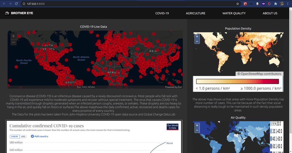
BROTHEREYE Home page (above)

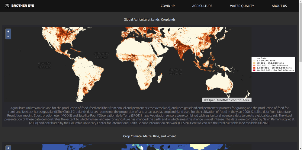
BROTHEREYE Agriculture data page (below)


After seeing some sample sites provided by the Challenge resources, we realised we can build an upgraded version of these sites, keeping the overall view concise but informative and interactive at the same time. Basically, we aimed at serving the huge data within your grip.


How I Developed This Project

Tech stack used:

->Python

->Javascript

->Django

->CSS

->Bootstrap

->requireJS

->plotlyJS

->React

->Node JS

->Webpack

->arcgis

->esri maps

We render Maps using ArcGIS and OpenLayers API. We use Django for the backend to make the site fast and use client-side rendering and React to code our frontend. React helps us to create concise single-page applications.

 And then we dynamically add the Dataset mask over the base layer.


We use the COVID-19 Data from JohnHopkins University and plot the daily statistics of COVID-19 cases from every country. Along with that, we provide Maps of different datasets Like average CO cover, Climate change effects etc to study the disease and its virulence.


The problems which we faced are making the website interactive for every user and breaking down the data into small sections along with the entire data to be served at the same site.

We have solved this problem to a certain extent. The only thing left for us to do is to add more data and some query parameters.

How I Used Space Agency Data in This Project

We have used NASA Earth Observations, MODIS, Landsat and Copernicus. 

We have used the Earth Observations Datasets from NASA Earth observations and Nasa GIBS which involve air quality, water quality and agricultural datasets

For average land and sea surface temperature, we use the MODIS Datasets.

For chlorophyll, NO2 and CO Datasets we use GIBS.

We Esri and Openlayers for the Maps and John Hopkins University Coronavirus dataset for the COVID-19 study.


Project Demo
Earth Observing Dashboard Integration

We made it using react so it can be easily integrated into Earth Observing Dashboard. It is open-source and uses datasets from ESA and NASA APIs curated for this hackathon.


The dashboard we developed can be easily tweaked to match The Earth Observation Dashboard style. But we designed some parts adding our own touch to it.


To view the application clone the git repo and run the django server using:

python3 manage.py runserver


To view or change the application frontend code you can go to the src folder in the static directory of reactfrontend app and run :

npm run dev


Link to Code

Data & Resources

NASA GIBS

SEDAC

Sentinel Data Api

Copernicus Data Api

SEDAC WMS

John Hopkins University Covid-19 dataset

Esri webmaps

Earth Observation Dashboard

Tags

#airquality #coronavirus #stayathome #endcovidby2021 #eodashboard #tofreedataworld

Judging

This project has been submitted for consideration during the Judging process.