Awards & Nominations
PixelGrow has received the following awards and nominations. Way to go!

PixelGrow has received the following awards and nominations. Way to go!
The COVID-19 pandemic is currently bringing unprecedented impacts to every aspect of human life. Your challenge is to better understand societal trends in response to COVID-19 through the analysis of remote sensing data and products.
This project indicates and visualizes future economic trends and societal change during Covid 19 pandemic for specific regions. Global entrepreneurs, policymakers are challenged to make pragmatic changes in our economy amid this pandemic. We analyze the datasets, RPM AND SPM, CSV graphs, and histograms to indicate the changes. Users' preferred city's dataset will give them the overall approach in 9 different comprehensive routes. Our solution can provide a holistic assessment of post and current COVID-19 impacts, mobility data, human activities, which envisions what the economic trends portend and predicts the feasibility of whether to invest in an offline or online startup.
This pandemic has created downward escalating problems for economic planners, startups, traders and entrepreneurs. By comparing the past and current COVID-19 situation, we analyse which country/city stands the best in sustainability and get back to their normal economic condition amid this crisis. Our challenge was to make a solution to visualise the data more efficiently.
To make this solution, we take SPM-RPM, Activity Data of car activity which will generalise the infield progress of that area, mobility Data
•Business trends in the specific city:
Many entrepreneurial firms have shifted the global economy, which is assisting in the change of the situation. Entrepreneurial business models and approaches are drastically slowing down and affected by the pandemic. So, to save the economic planners and startups, our system will show the viability of that specific region to start their business project through an online and offline activity using the satellite views of the European data club and Nasa's satellite views.
•Colorwise visualisation: Here, a user can be able to identify the upgrading or degrading scenarios of a specific region and decide whether starting a business over that region is feasible or not. Vehicle and construction activity has slowed during COVID-19 shutdowns and where this activity has recovered respectively, showing a blue indicator and offering yellow arrows. This whole data will be visualised through RPM and SPM data resources.
•Country wise economic indicator and main insights :
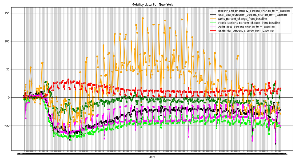
The increased rate of covid 19 has impacted the envisioned economy and the prominent sectors. Increased rate of lockdowns picturesque the immobility of everyday activities and decreases the covid spreading rate. Beijing shows the highest rate of advanced progress both in finance and dropping the virus spreading rate. At the same time, Newyork shows the opposite scenario and a high covid 19 spreading rate.The same scenario prevails in Washington, D.C., and Los Angeles.
•Data visualization through graph 📊: Data visualization through CSV graphs of car activities and economic situation .for example, the CSV data collected and combined from PALSAR-2 uses L-band SAR mounted on JAXA's ALOS-2, and C-band SAR mounted on the European Sentinel-1, tracks production and movement at factories and ports importing and exporting cars to monitor the increase and decrease of new car production. This car activity can represent which city has more outdoor activities and recreation.
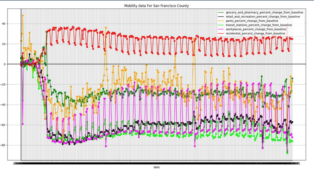
•Mobility data (human activities, workouts, onboard activity): All Over the world, the outdoor, recreational activities, workouts, etc is under the usual sphere. To visualize these, the community mobility report provides insights into what has changed in response to policies aimed to combat Covid19. This data will have the highest standards on movement trends over time across different categories of cities such as Recreation, groceries, workplace, residential, and urbanized model.
•Ultimate solution for economic growth and better Business areas: the overall situation will be analyzed through remote sensing data, RPM SPM Satellite view to offer the right track to the startups, economic planners, or entrepreneurs whether to start the business online or offline media. The specific city will be divided Into nine comprehensive routes to give the user an overall magnified data to navigate throughout the city.
PixelGrow is a comprehensive solution for detecting social, behavioural changes, which aims to predict if a selected region is suitable for a particular sort of business or whether it should relocate. The nations that can limit COVID 19 while keeping their economies afloat with minimum environmental effect have the best opportunity of rebounding back sustainably after this crisis. They should be aware of environmental and societal changes to make better decisions for themselves. In this situation, our solution makes recommendations based on the recovery rates of RPM-SPM, human activity data, Google mobility data provided on the Eo Dashboard. It also compares the cities according to their environment under control and how easy it is for business. This solution gives users, investors, business people, innovators, and companies access to immediate decisions for their business.
General overview of the data usage: Slow down Proxy, Recovery Proxy,(for car and containers indications to measure the active working operations)Google Mobility data, and Activity data show the multi-dimensional impact of country lockdowns, Human access to the environment, the denseness of cars on the road and other interventions in societies. Not all the governments applied lockdowns which resulted in an increased spread and risk of Covid; conversely, not lockdowns were implemented the same way. That’s why a solution that may suit Washington DC may not work in Beijing. But Beijing has bounced back its economy on the standard track faster than any other developed country. Below is the general criteria for visualizing the Eo Dashboard’s data:
1.Satellite spectral data visualization (Slow down Proxy and Recovery Proxy) is captured as screenshots from the EO Dashboard
2.We processed those sample image using Simpleimage processing library in Python;
3.Activity(cars/containers) data downloaded in CSV format from EO dashboard;
4.Human mobility data for regions are taken from google mobility data
PixelGrow, a developed integrated visualised solution that can portray societal behavioural change for many cities. It understands societal patterns and provides solutions based on this. This solution determines whether a specific business is safe or not based on the city's present state. It depends on human activities in the urban area, transportation allowance, and recovery rates of the specific town from covid-19. It also gives suggestions on what types of Business anyone should launch based on the socio-economic pattern and societal changes of a particular area. To make proper predictions and offer advice, we use SPM-RPM data, Mobility data, and Activity data. link:https://www.youtube.com/watch?v=-rWlMMvUh2Q
This Project can easily be integrated with the Earth Observing Dashboard by running the given codes in the Backend of the Dashboard. This Source Code can Analyze any high-resolution Map Image of any country/city; this can be applicable for all the world regions. Terrain light version of both the Map is required to get a more accurate result from the data. The Recovery proxy and Slowdown Proxy Maps of a definite region/city/country can be compared, and the specific region is also segmented, and the graph is produced based on the data collected from the Map through Image Processing. The accuracy of this program is proportional to the image resolution and also the Sentinel-1 Images. This program can basically identify all the marked regions and estimate based on that specific reading of the Map. The graph that is automatically produced by the program is beneficial to understand which area is in a particular region is under more restriction, or the people are tending more to stay at home or go outside. So overall data, as well as specific area based data, is easily collected from the given data, run through an image processing program, which can significantly improve the Users proper understanding of the present condition of the specific region, summarized by graphs and actual rate comparison and also prediction of Societal and Economic Changes.
The code is given below through the GitHub link:1. https://github.com/nayeem-17/NASA-EO-dashboard-hackathon
2.https://github.com/raihanrsd/NASA-EO-dashboard-hackathon
Steps of Integration of the Image Processing Data are as follows:
Running the code over a specific region after collecting high-resolution pictures;
It can't analyze a specific region unless both the data(same images) of that region's recovery proxy image and slowdown proxy image aren't provided; The images(recovery proxy and slowdown proxy) must be Congruent to one another (of the same region) to get accurate image data analysis. This program should be run over 2 images simultaneously as it can only generate results based on the two images(recovery proxy and Slowdown Proxy). A graph is produced by the program by dividing the specific region into 9 distinct parts or any number of regions that the user wishes(by bringing a minor change with the code) to provide a much clearer picture of the societal change of the people in different regions of the specific area. Here, after analyzing the mobility data for specific regions we get some graphs that allow us to get a firm idea about the human density in different places of a city. Showing the graph in the front end, a user gets a good indicator of societal and economic change in a certain city. The raw number-based data, extracted from the images, may also be shown to the user if they wish to see it for better analysis and understanding the impact of the current situation; Users get predictions or financial advice of investment based on the data extracted. Prompt is generated for each of the regions based on the current activity rate Comparison.
List Data and resources:
Literature Data:
Data Sources
2.Urban Societal Behavior change datasets: /challenges/economic-impact/urban-societal-behavior-patterns-during-covid-19/details
3.Google mobility data on recreation, groceries, workouts, groceries and pharmacy, transition stations: https://www.google.com/covid19/mobility/
4.Recovery Proxy map: https://earthdata.nasa.gov/covid19/explore/be?map=116.7214%2C40.1631%2C12.2&layers=recovery&date=2021-03-01
5.slowdown Proxy map:https://earthdata.nasa.gov/covid19/explore/be?map=116.5077%2C40.0579%2C12.13&layers=slowdown&date=2021-03-01
#pixelglow #visualise #imageprocessing
This project has been submitted for consideration during the Judging process.

