Awards & Nominations
Nasa Ship and Air Investigators has received the following awards and nominations. Way to go!

Nasa Ship and Air Investigators has received the following awards and nominations. Way to go!
The COVID-19 pandemic strongly affected global logistics and supply chains, and hence shipping activity. This challenge asks you to target the characterization of dynamic shipping activities as seen from space.
Our presentation targets the characterization of dynamic shipping activities and the impact that it has on air quality. As we all know, our global economy relies on ship traffic because it allows us to export goods and products to other countries. However, when ships burn fuel for energy, they emit several types of air pollution like NO2 and SO2 into the environment. These emissions impact the air quality. In our presentation, to prove our point, we used reliable sources, maps, data, and articles from the internet. We were also able to show the difference in air quality before and after the pandemic. Overall, in our presentation, we focus on answering the three major questions.
This is a link to the end project presentation.
CLICK TO VIEW THE PRESENTATION
FULL URL JUST IN CASE (https://docs.google.com/presentation/d/1uF8iJGhmQg9-s545qVFSPTgfMUQ6_dVPvmnDFedVtoE/edit?usp=sharing)
In this presentation, the team has answered the 3 main challenge questions of dynamic shipping activities seen from space. We talk about the patterns observed between shipping dynamics and air quality parameters. Adding on to that, we inform about the shipping dynamics along major shipping routes developed during the pandemic in comparison to pre-pandemic years. Furthermore, we included data on the underlying seasonal patterns with regard to the lifetime of NO2 and SO2 in the atmosphere. All of the research and data were collected from trustable sources like Esa, Nasa, and Jaxa. To study our results better we included data tables that were created by the team members. We also generated a map that shows the wind blowing emission plumes from ship smokestacks that match the ship tracks. This was generated to show the impact of ship traffic on air quality.
The challenge that we took on was ship traffic and the impact that it has on air quality. We chose this challenge because we thought it was important to present the main point about how, why, when, and where the air gets polluted. When we compared to other forms of transportation, ship traffics is the most energy-efficient when it comes to moving enormous objects. Even though ships are responsible for 18 percent of the air pollution, the shipping industry is very important because it’s a global economic engine that helps other countries trade goods with each other. So, it’s difficult to get rid of the shipping industry. But, looking at our presentation will help the scientists and researchers to plan out new regulations and practical initiatives to reduce the amount of air pollution produced by ships.
Our presentation summarizes the answer to the overall question of ship traffic's impact on air quality. We have collected data and research from multiple sources and have added some data of our own. We combined them to create a great detailed PowerPoint. Our map shows the pollution in the air from ship emission. To understand the map, look at the color on the map and match it with the color on the bar on the side. Then, read the number closest to the color and round it to find the level/amount of pollution from the ship's emission. As a team, we hope to achieve a good knowledge of ship traffic and air quality. We also hope to achieve great presentation skills, time management skills, and creativity.
Our team includes members who enjoy studying astronomy and cosmology. Our group chose this challenge because we were all curious to learn about how ship traffic has a huge impact on the air that we breathe every day. By reading the backgrounds and the objectives, we knew that ship traffic caused air pollution, and it was bad for the environment and human health. We were very interested in this topic and wanted to learn more about it, so we chose this challenge. Also, NASA inspired us to choose this challenge because we were all looking for a project that was related to space and the environment. For our overall submission, we created a PowerPoint answering important challenge questions. We generated a map that shows the wind blowing emission plumes from ship smokestacks that match the ship tracks. This is to show the impact of ship traffic on air quality. The map was generated on EDC. We used the Jupyter Notebook in EDC. Xcube was also a great powerful tool on EDC, which helped us a lot to generate the map. Coding was used to create trial maps. To create the final map, we combined wind data with NO2 data. A lot of other details were added and edited on the map. For example, isolating just water pixels of the map. However, we generated a great map at the end. We were able to prove our points using reliable sources, such as maps, data, and articles on the internet. We mostly used data from ESA, JAXA, and NASA. One problem that our team faced was that sometimes when we read the questions in the "Objective" section, we tended to overthink them and it took us quite long to figure out the answers. Also, it was hard for us to find the information because we mostly had to look up information from NASA, ESA, or JAXA websites. One big achievement that our team had after this project was to have a deep understanding of the ship traffic, how it pollutes the air, and how much it pollutes the air. Also, another achievement we had after completing the project was creating a powerful detailed google side.
We used Space Agency Data in this project by answering and analyzing the questions that NASA has about this challenge. Those questions on the “Objective” section and “Potential Consideration” really help to guide our whole process in solving and completing this challenge. Since we were recommended to research from NASA, ESA, and JAXA, we collected our data from those websites. We read through some articles, textbooks, and data tables on those websites to get the most precise and concise answers. Not only did we look through some articles and textbooks, but we also viewed some maps, charts, and pictures. We used data from https://maps.s5p-pal.com to create the data tables on our slides. To create the maps, we used data from the EO Dashboard (https://eodashboard.org). We collected NO2 data from that website. Overall, Space Agency Data was used a lot to create our final project.
The demo includes a link to the final project presentation.
FULL URL JUST IN CASE (https://docs.google.com/presentation/d/12LodQUGj_0klqgFQx-gVqomkucphnuHaihEuiOj6ilw/edit?usp=sharing)
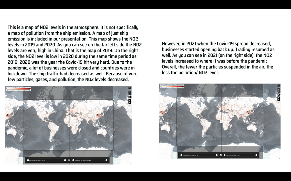
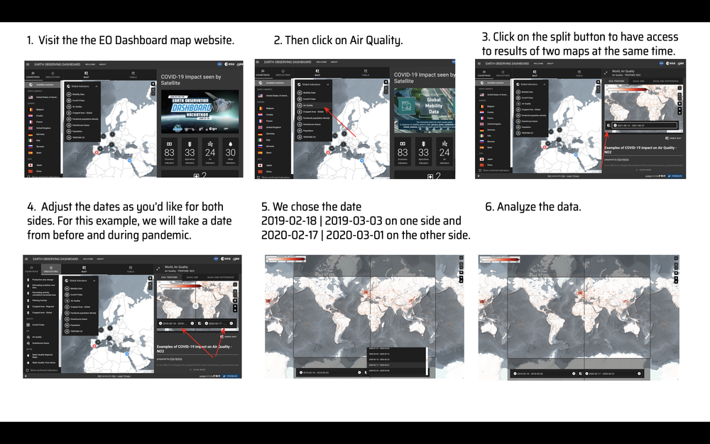
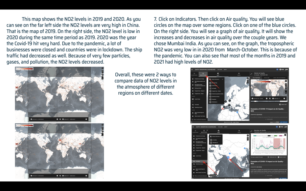
Our solution can be integrated into the Earth Observing Dashboard with the help of the EO Dashboard Map website. We can adjust dates and analyze air quality in the different regions. You can get detailed information on the NO2 levels in different regions during different times of the year. We can use this analysis to prove that there was less pollution during the pandemic than before the pandemic. We can also, prove our point of seasonal impacts on air quality. You can change the dates to the cold months and the warm months to find the results of air quality. The following images with descriptions show how our solution could be integrated into the Earth Observing Dashboard. Use the following link to follow the instructions/steps below.
The data we used were the NO2 levels in the Atmosphere over the oceans and the ship lanes/routes. This data was used to create maps and the final project. We also used the data of SO2 levels in the atmosphere from ship emission to answer some of the challenge questions. Also, wind data and the Sentinel 5P data were used to create the map. We used data from the past couple of years to confirm our results and to compare the data from before and after the pandemic. Moreover, we added research/data of some major ship routes and ship ports in our project. We did most of our research from NASA's, ESA's, and JAXA's websites. These are the websites we did our research from.
#Air Quality, #Ship Traffic, #Air Pollution, #Economic Impact #Maps #Data and research #Marine transportation
This project has been submitted for consideration during the Judging process.